ag icon   ag icon ag icon
block case study
+Home
+Projects
+Case Studies
*About
*Resources
+Connect
block case study equanimous logo block case study

Visual Brand / Equanimous Health & Wellness
Equanimous Visual Brand

The development of the Equanimous Practice brand included the design and development of the identity, the messaging, and the visual brand., Including the logo, tagline, messaging, statements, and the layouts for the business image for marketing and advertising.

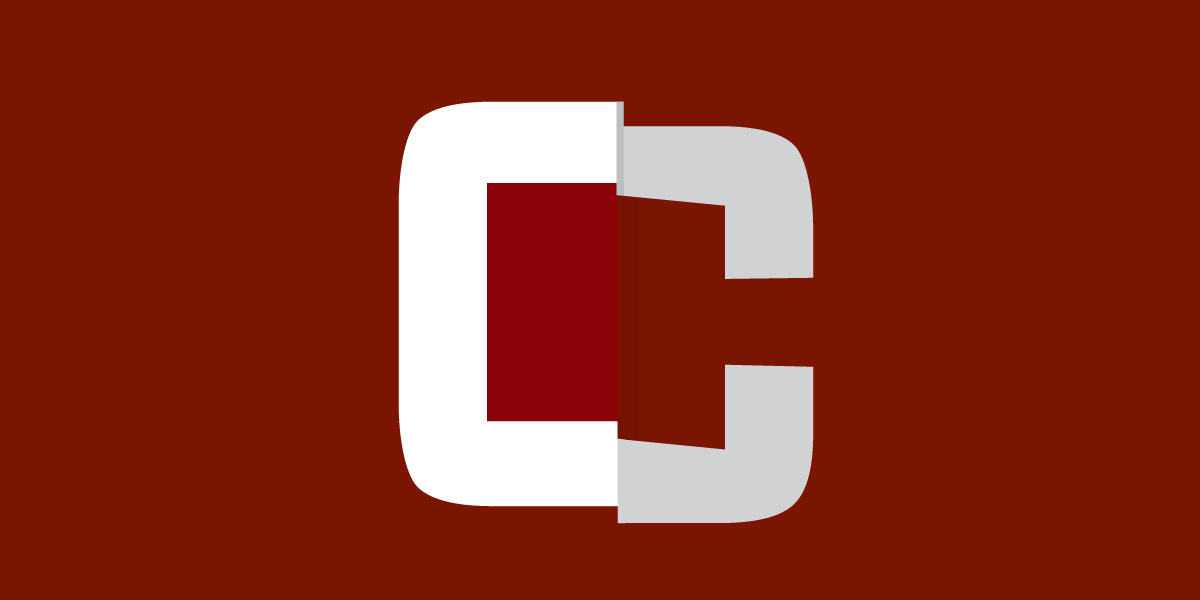
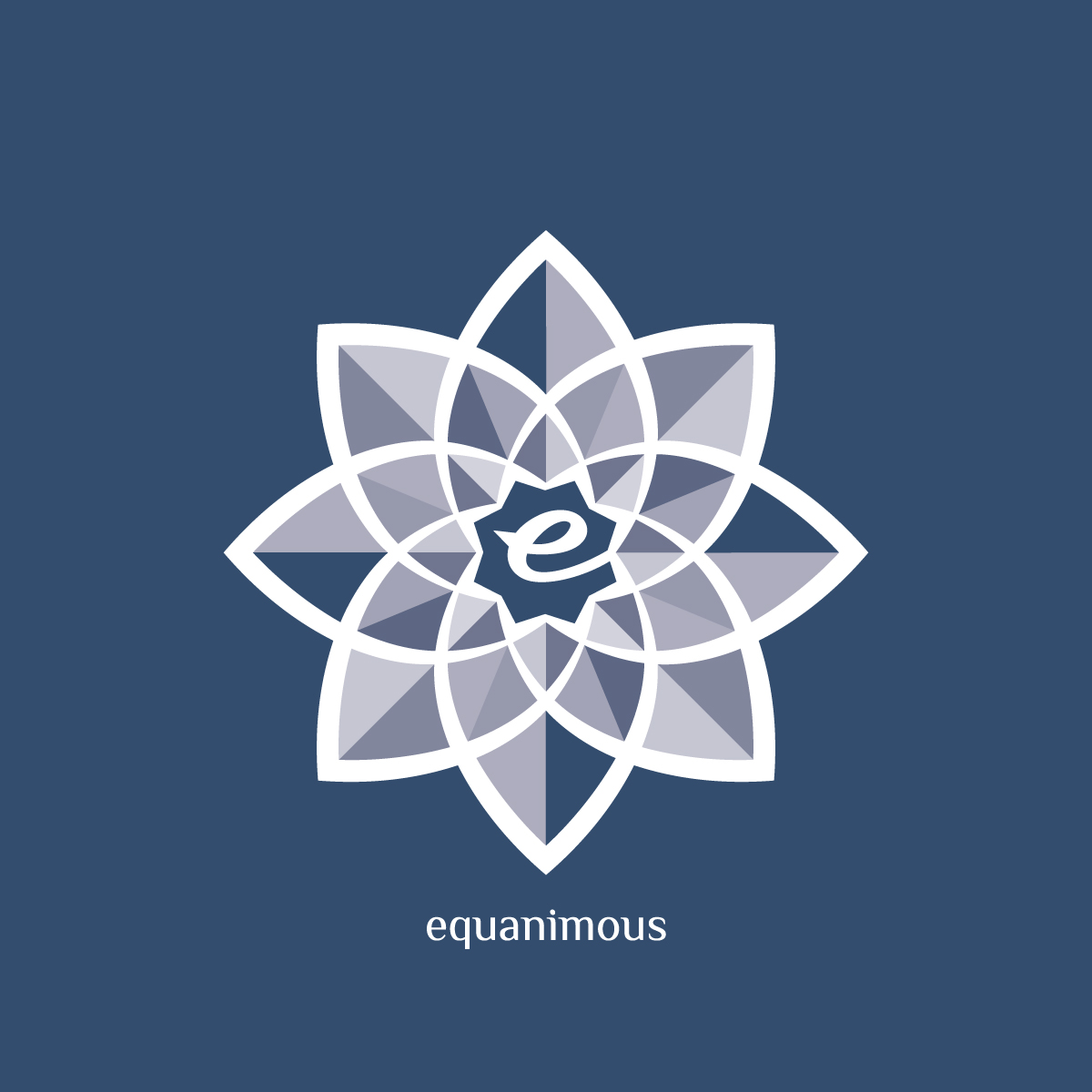
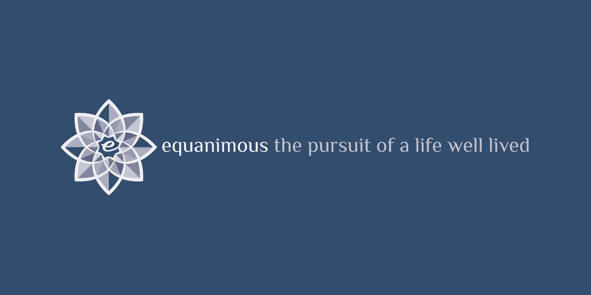
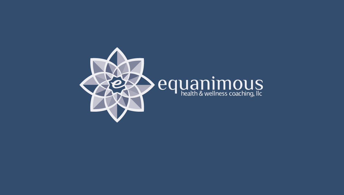
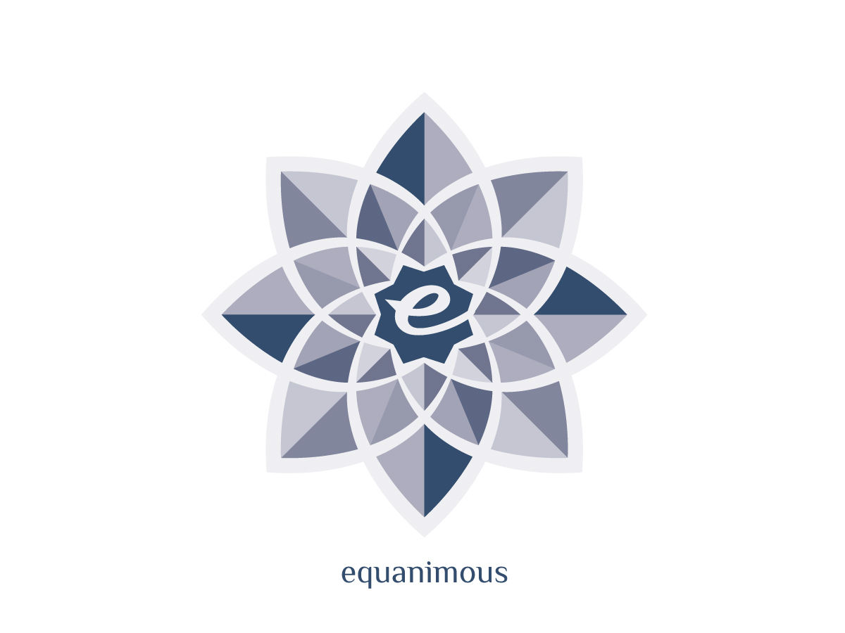
The logo design was based on the Practice ethos, the meaning behind the name, and the association of wellness, the lotus flower. The goal in the design of the logo was to create something that wasn’t limiting in its usage and application, and could be applied broadly. The logo was responsive in how it was fleshed out, with the Practice name, tagline, tagline, statements, and calls-to-action.

In the development of the Practice brand, establishing the tone and feel was essential. Achieved through the writing, the goal was to convey a confident and assertive tone. Once the core business statement was created it was developed into the tagline, messaging, and a suite of statements. With the tone and feel of the writing established, it became a foundational ingredient of the business image.

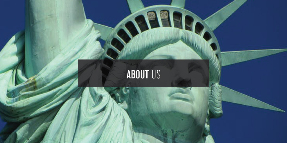
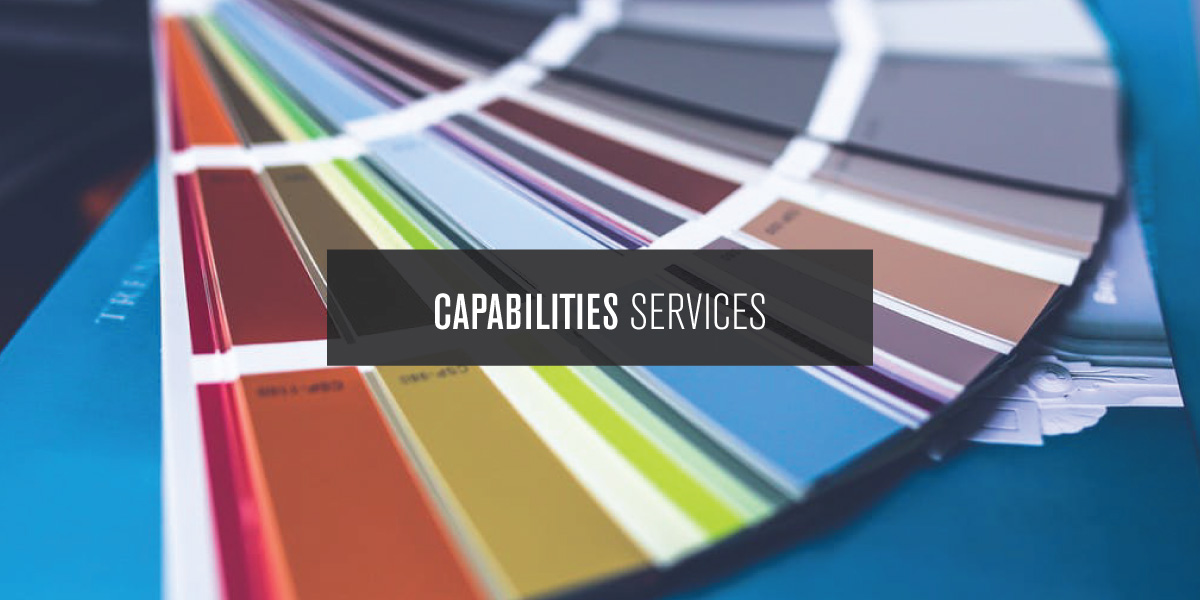
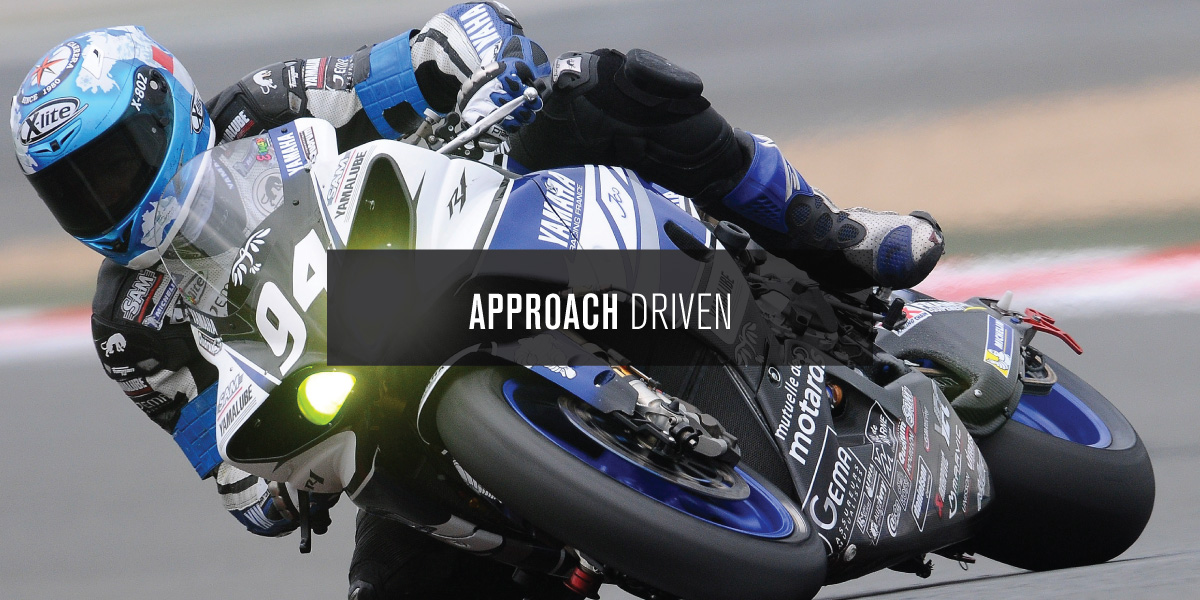
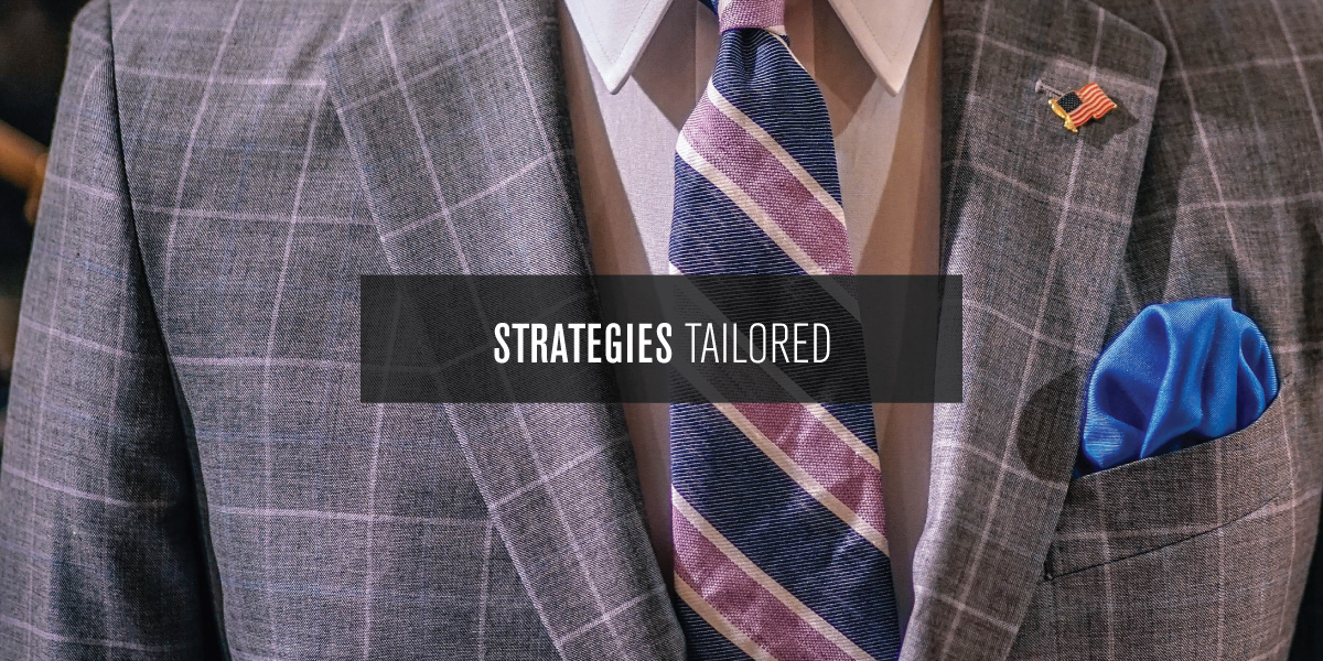
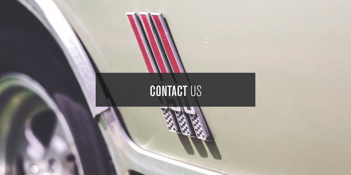
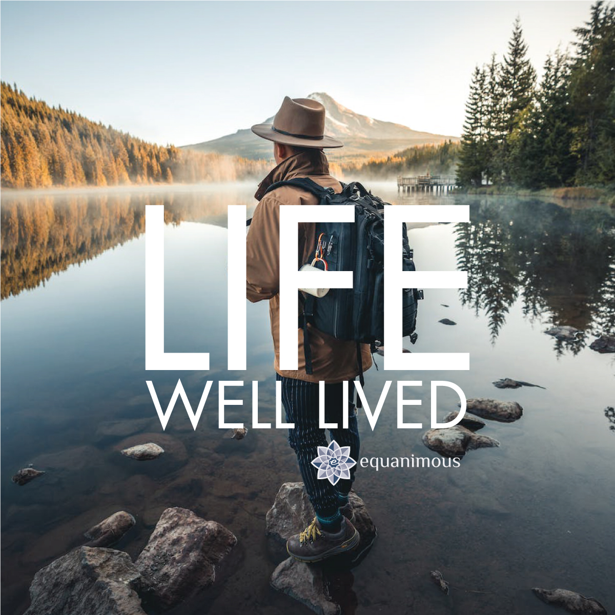
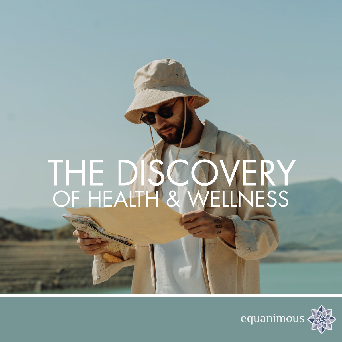
In the design of the Practice business image, the photography and typography play an important role. In the layouts, the typefaces, typesetting, and imagery reflect the tone of the writing. The photography chosen was essential to the business image, both in the concept of the imagery and establishing the feel of the creative. The assertive tone of the messaging was reflected through the large typographic statement that juxtaposed perfectly with the chosen photography.

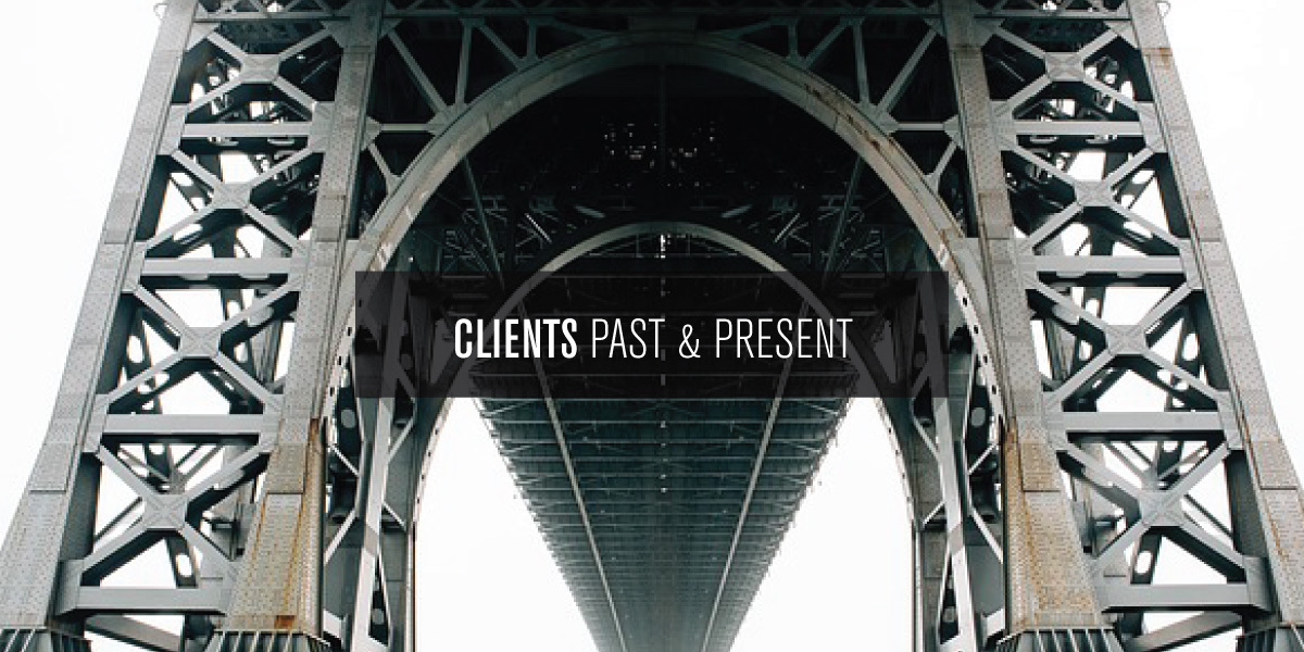
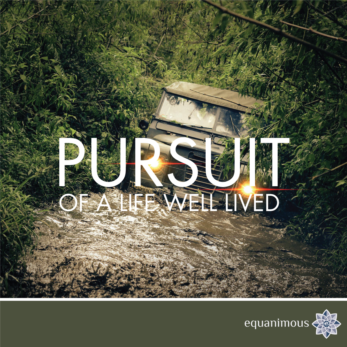
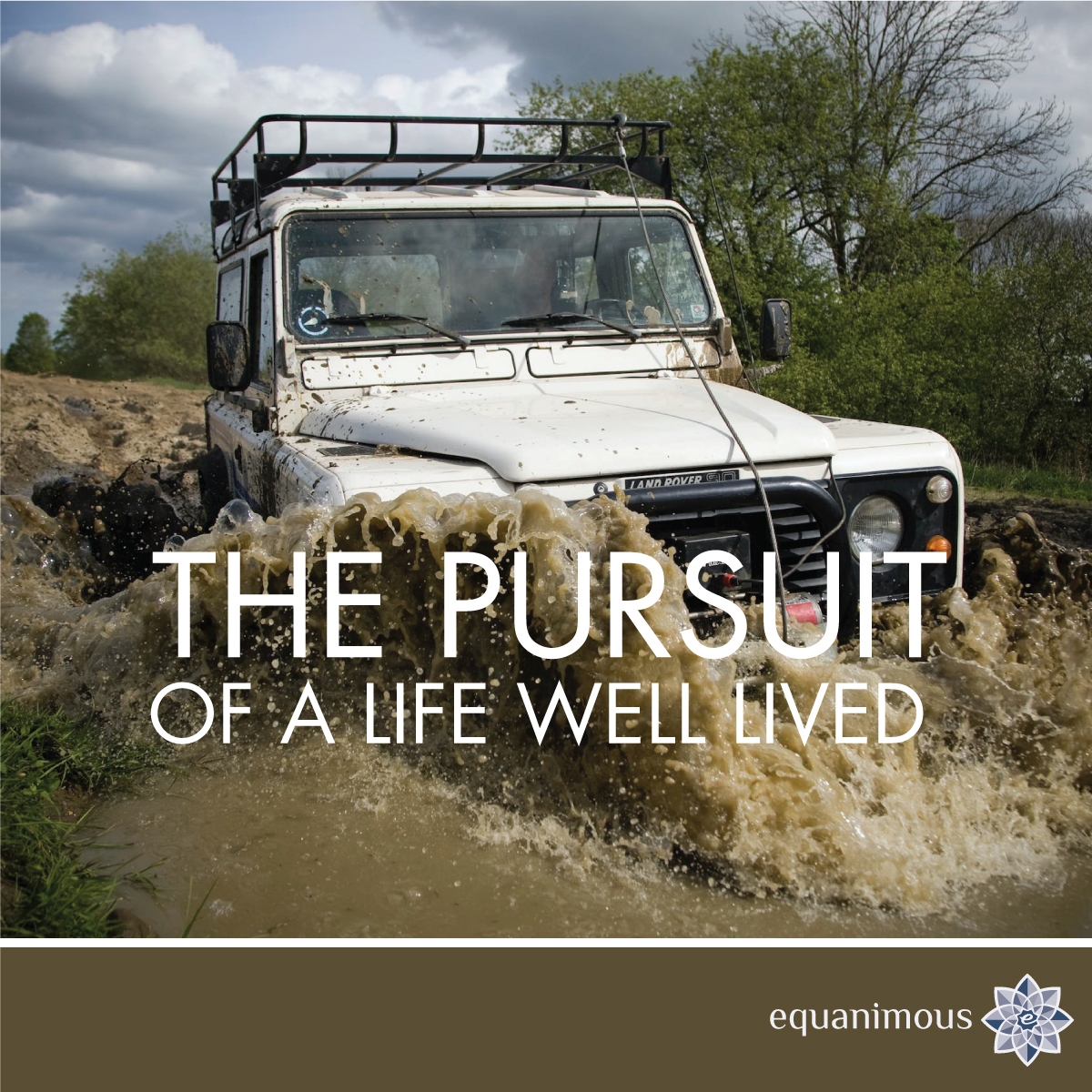
From the primary business image, additional layouts were designed, using the palette of statements and messaging. These layouts contained the core ingredients in the primary design to keep it within the visual brand. The flexibility enables the client to keep their marketing, social media content, and promotion fresh, while being brand consistent.
social line
design solutions
block case study thato dadson logo
thato dadson logos thato dadson secondary logo thato dadson responsive logo thato dadson images identity block case study block case study thato dadson business image block case study thato dadson business image thato dadson business image block case study
Project Summary & Notes
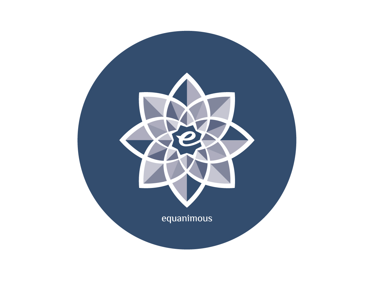
The logo was intended to be responsive from the start, using shape, color, and typography to achieve the responsive gain of function, ensuring the logo does not conflict with colors in the photographer’s images, using alternate shaped versions of the logo that ensures it works in all spatial real estate. The grey color ensures the logo does not conflict with the photographs and works with the color in the photographs., More importantly this approach ensures the photographer's work stays the main focus whenever the business is represented.
agency statement icon
block case study
thato dadson identity
Project Photographer Identity
The project included the design of the logo, identity system, and business image for this talented photographer. The identity design and business image included the design of a responsive primary logo and identity system, responsive color palette, typography system, stationery system, and the business image. asterisk navigationView Project

block case study
reach logo by adam garlinger
Project Brand Development
Victory is a business initiative and brand that connects clients, customers, and relevant businesses, to build a truly independent business ecosystem. The visual concept was based on the vintage butcher chart, to illustrate and communicate how businesses are connected with each other inside an industry, location, and relevant offerings. asterisk navigationView Project

block case study
reach logo by adam garlinger
Project Company Logo Redesign
A provider of services, activities, support, and programs for children and children with developmental issues, the identity system design for the Reach Organization included a logo redesign based on an existing logo, to better convey the organization's mission. asterisk navigationView Project

block case study
attorney logo design by adam garlinger
Project Attorney Practice Identity
DDeveloped as part of the identity system and the foundation of the design language, this typographical logo incorporates the initial of the law firm's name with a visual elements that represents the scale of justice. As part of a comprehensive identity and firm image, the logo was applied to law firm messaging to create graphic elements, utilizing a bold color palette to work as a design element with the statements that reflect the law firm's beliefs, providing the law firm with a unique look to stand out in a competitive industry and geographic location. asterisk navigationView Project

block case study
brunswick letip logo by  adam garlinger
Project Identity Design
A chapter of LeTip International, the identity development of this New Brunswick New Jersey LeTip chapter included a logo, identity system, and messaging, with the message and writing based on the benefits of membership. asterisk navigationView Project

block case study
transformation bureau study adam garlinger
Project Identity Design and Naming
A consulting and advisory firm, Transformation Bureau provides their clients with advisory services centered around measurement, goals, and building client's business based on measurable results. That concept was incorporated into the naming of the business, the logo, and identity system. asterisk navigationView Project

block case study
central jersey business circle logo by adam garlinger
Project Identity Design
The logo design and identity development for Central Jersey Business Circle included a typographical-styled logo, secondary logo marks, a suite of graphic elements, typography, color palette, and business message, writing and statements. asterisk navigationView Project

block case study
search architects logo by adam garlinger
Project Identity Design
The logo design for Search Architects uses form, shape, and relevant visual elements to form a unique graphic element that represents the service provided and the function of the name, with the elements of the logo, including the typeface, applied to a secondary logo, wordmark and graphic elements that make up the identity system. asterisk navigationView Project

block case study
voice artist logo by adam garlinger
Project Voice Artist Identity
A voice artist with range, Dovina Laurence provides vocal services for multiple mediums that help connect the audience to the products, services, and business through the spoken word. The identity development included the logo and identity system, artist' business image, visuals, differentiator and messaging based on the artist's differentiators and value proposition. asterisk navigationView Project

block case study
comedy night event image design by adam garlinger
Project Event Poster and Event Brand
The Comedy Night event was an ongoing event held annually to raise money for, and awareness of the Reach Organization. The third event, this poster and corresponding design of marketing efforts was designed based on carrying forward and building on the look and feel of the first two posters to extend and build on the brand. asterisk navigationView Project

block case study
snapme swimwear identity by adam garlinger
Project Swimwear Brand Identity
SnapMe Swimwear creates clothing, apparel, and swimwear for babies, toddlers and children, making days by the pool and at the beach easier through product features and innovative product design. The project included the logo redesign and comprehensive identity system, with the developed identity system applied to product visuals and materials to help differentiate products and product line. asterisk navigationView Project

block case study
wolverine logo design by adam garlinger
Project Identity Design
Developed to convey strength, non trade-specific, and work in multiple industries, this logo mark relies on typography as the major design element. The identity system is comprised of the primary logo, icon, wordmark-like graphic, and color palette, the letter W within the logo and identity system represent the animal's claw or the wounds from the claw, a concept carried throughout the identity system. asterisk navigationView Project

block case study
logo by  adam garlinger
Project Logo Design & Identity
Logo design and identity design work for businesses, brands, and independent professionals, ranging from industrial doors, pet services, insurance companies, creatives, and attorneys, from graphics only to typographical namemarks, from single logo to comprehensive identity systems. asterisk navigationView Project

block case study
craftsmen and tradesmen logo by  adam garlinger
Project Tradesmen Logos
In professions, trades, and industries saturated with heavy competition, with and abundance of choice for the consumer, the logo, identity, and business image is essential for contractors, masons, electricians, painters, and other professionals heavily saturated with competition and choice. Compelling logo design and business image is essential and ensures the business stands out and thought of first when customers need their services. asterisk navigationView Project

block case study
typographical logo marks by  adam garlinger
Project Typographical Logo Design
Often called a wordmark, lettermark, monogram or logotype, a typographical logo incorporates relevant visual elements into initials, a letter, or the written word to create a logo or graphic element within an identity system. Ranging from a visual choice to a strategic decision for a business industry saturated with competition, this approach ensures the name and the product or service provided is represented one visual element. asterisk navigationView Project

design solutions
block case study block case study block case study image case studies by adam garlinger image
Select Case Studies
The select project case studies and in-depth examination of strategy, approach, process, and the development of creative that provides the solutions clients need to build their brand, establish the presence of their business, generates revenue, strengthens online visibility, and evolves the creative that ensures their brand is fresh and relevant in markets saturated with competition. asterisk navigationview case studies

learn more about adam garlinger button

design solutions
block case study recent projects block case studies by adam garlinger image
Recent Projects
The recent work and latest projects from Adam Garlinger, including building an online brand, carrying forward and applying and existing brand into a new brand, and building on the established value to generate revenue, in projects that include campaign development, building a brand and the development of a website under a brand umbrella. asterisk navigationview recent projects

learn more about adam garlinger button

design solutions
block case study featured projects case studies by adam garlinger image
Featured Projects & Work
The featured projects and works of Adam Garlinger, with projects that include brand development, building a product offering, business ecosystem development, visual branding, campaign design, website development, creative process, and the brand evolution of a renamed business. asterisk navigationview the featured projects

learn more about adam garlinger button

design solutions
block case study about adam garlinger image block case study
block case study capabilities and services of adam garlinger image block case study
block case study approach of adam garlinger image block case study
block case study tailored strategies by adam garlinger image block case study
block case study contact adam garlinger image block case study
block case study clients and partners of adam garlinger image block case study
design solutions
Located in New Jersey where Washington crossed the Delaware into New Jersey to win the war, Design Solutions Adam Garlinger is an advertising and design studio that helps clients differentiate their business from those they compete with...to stand out, be seen, and be remembered. Delivering the first impression their business needs to accelerate the return on investment that is their business.

38 River Drive, Titusville New Jersey | adam@adamgarlinger.com

Design Solutions Adam Garlinger | 908.581.3393
adam garlinger phone adam garlinger phone adam garlinger phone adam garlinger phone adam garlinger phone adam garlinger phone