


Brand Identity Development / Dovina Laurence
An emerging voice artist, Dovina Laurence helped businesses connect the audience to their products, services, and business through her vocal talents and skills, applied to commercials, narration, and other mediums where the spoken word is needed. As a new talent in a competitive profession and industry saturated with established talent and established relationships, this vocal artist needed an image and message that would enable her to immediately stand out.
Communicating a Voice
An emerging voice artist, Dovina Laurence helped businesses connect the audience to their products, services, and business through her vocal talents and skills, applied to commercials, narration, and other mediums where the spoken word is needed. As a new talent in a competitive profession and industry saturated with established talent and established relationships, this vocal artist needed an image and message that would enable her to immediately stand out.
“To reflect tone, range, delivery, and other essential qualities of this voice artist, a visual language was developed to reflect and visualize these elements, with the developed creative and graphic elements functioning as the identity system.”
Adam Garlinger provided Dovina with an identity, message, business image, and value proposition that would enable this voice artist to be noticed and stand out in an industry where established talent and relationships dominate the landscape., To give her a competitive advantage in the market where the known voice provide brands and businesses with a competitive advantage.


Project Development
How do you say and convey that a voice artist makes a business better?, The answer, “To create a connection between audience and a brand through the spoken word.”, was the foundation of the message and writing, and the concept the visual elements would highlight.
To reflect tone, range, delivery, and other essential qualities of this voice artist, a visual language was developed to reflect and visualize these elements, with the developed creative and graphic elements functioning as the identity system.
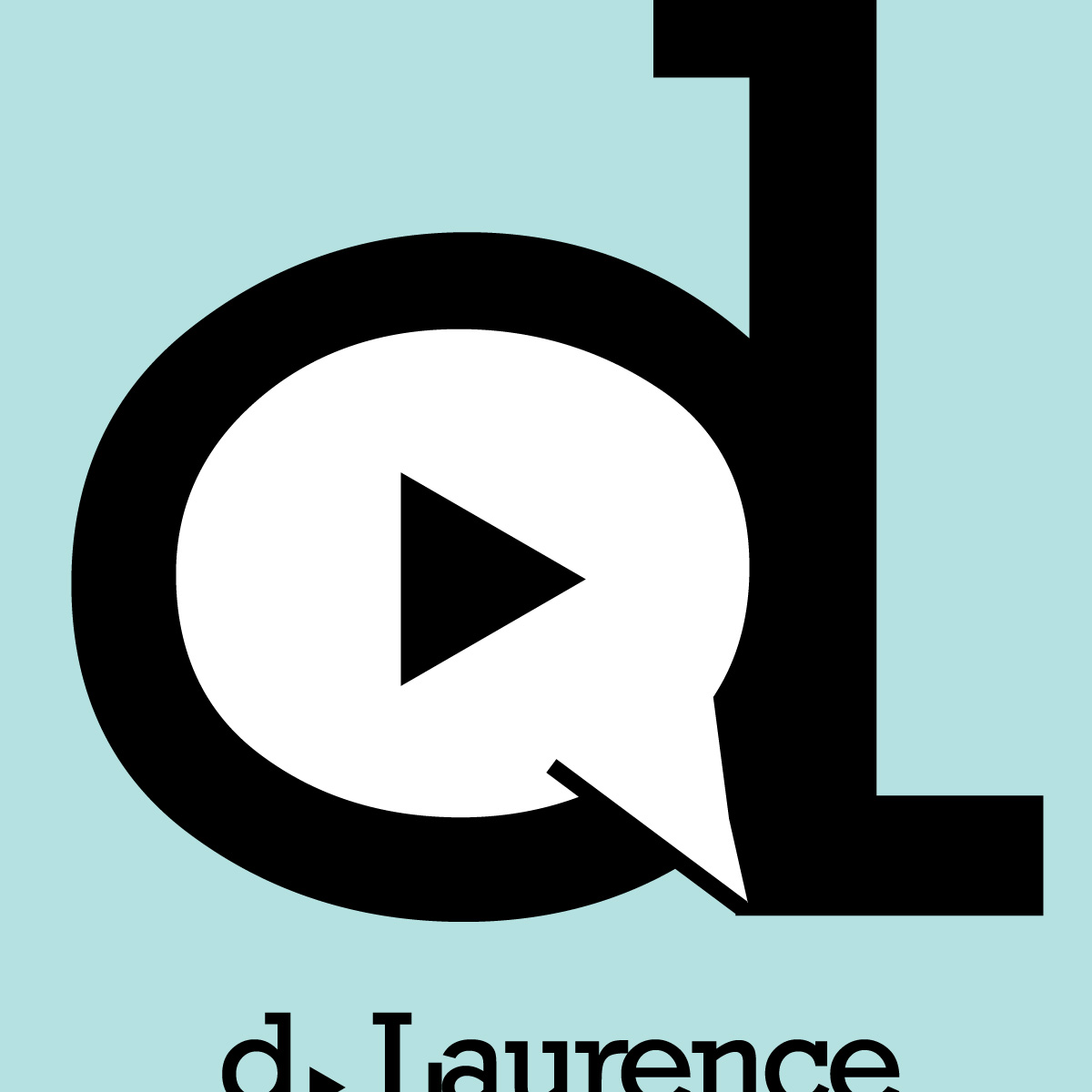
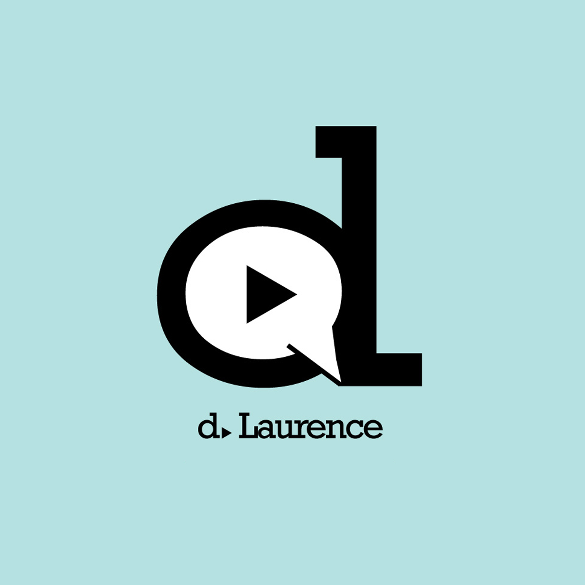
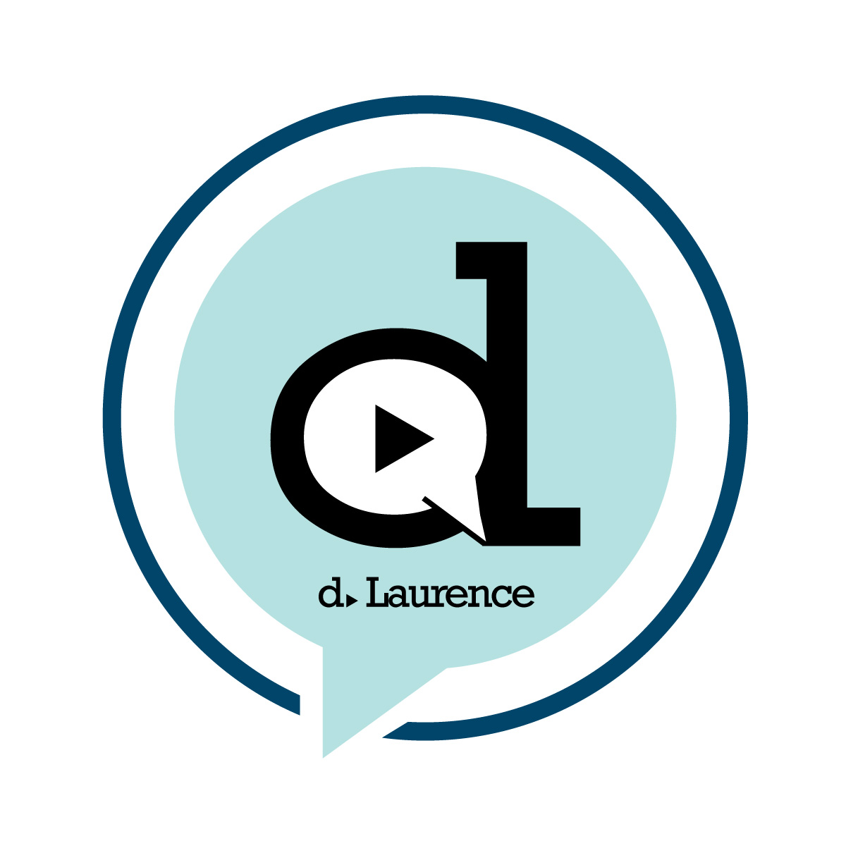
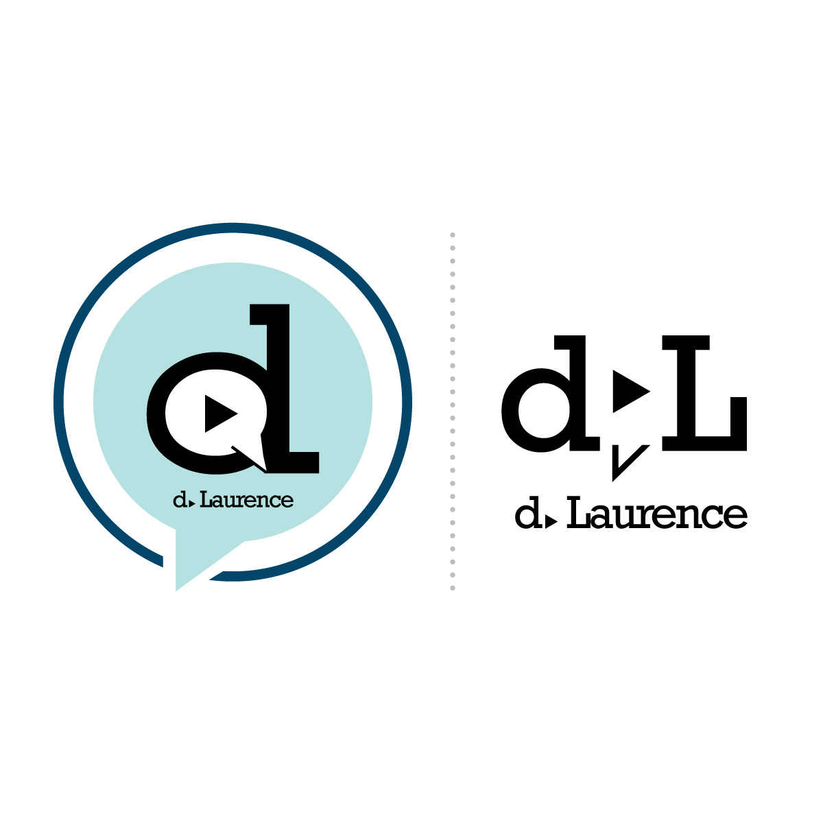
Based on visuals relevant to speech, voice, and sound, the elements of the primary logo; a play button and speech bubble were incorporated into the artist's initial and placed inide a speech bubble like holding shape.
The logo without the holding shape serves as the artist's trademark and was the anchor element of the alternate logos which used the color palette and graphic elements to represent range, tone, delivery and timbre., Qualities of the voice artist developed as visual elements created to help the artist stand out and apart.
How do you say and convey that a voice artist makes a business better?, The answer, “To create a connection between audience and a brand through the spoken word.”, was the foundation of the message and writing, and the concept the visual elements would highlight.
To reflect tone, range, delivery, and other essential qualities of this voice artist, a visual language was developed to reflect and visualize these elements, with the developed creative and graphic elements functioning as the identity system.
Based on visuals relevant to speech, voice, and sound, the elements of the primary logo; a play button and speech bubble were incorporated into the artist's initial and placed inide a speech bubble like holding shape.
The logo without the holding shape serves as the artist's trademark and was the anchor element of the alternate logos which used the color palette and graphic elements to represent range, tone, delivery and timbre., Qualities of the voice artist developed as visual elements created to help the artist stand out and apart.

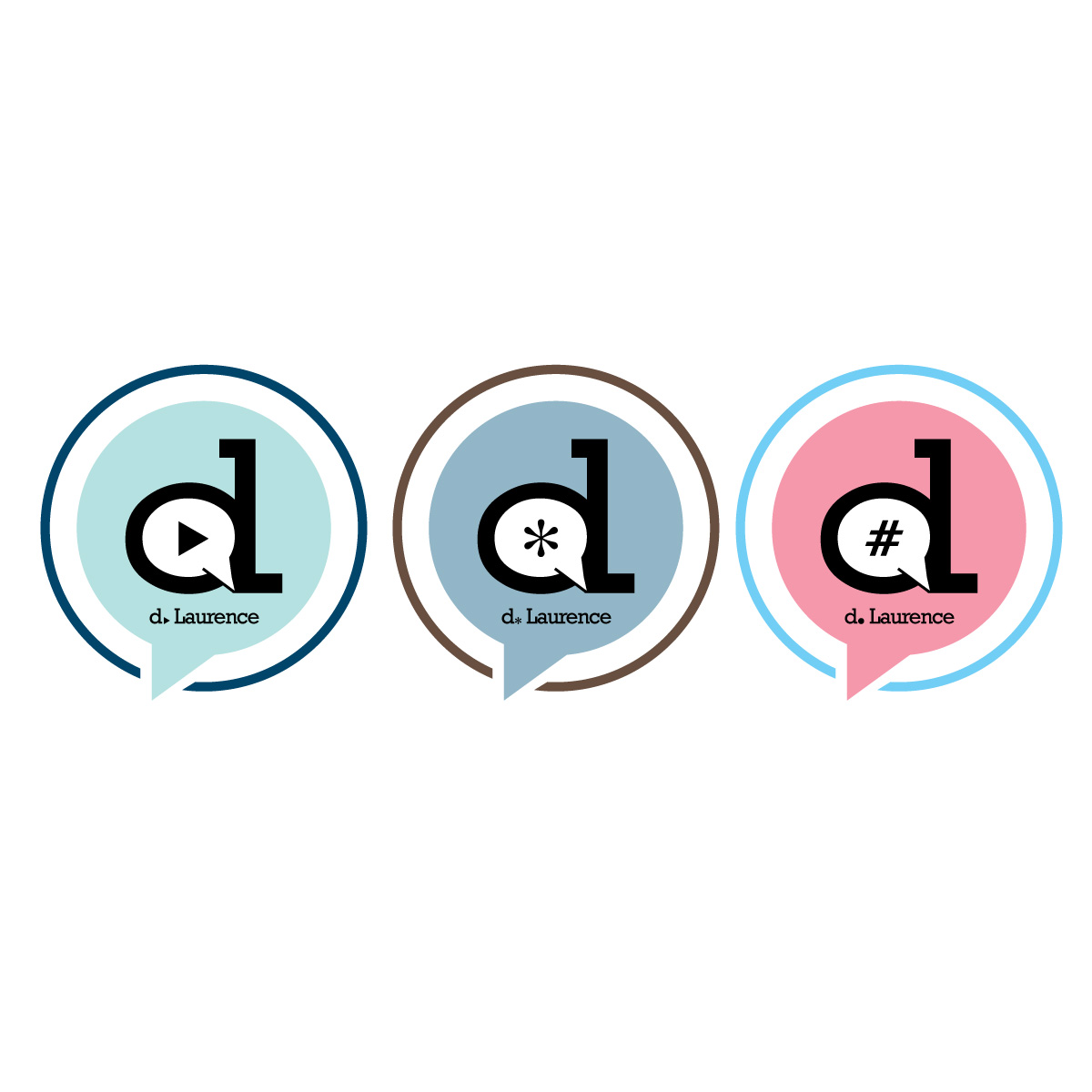
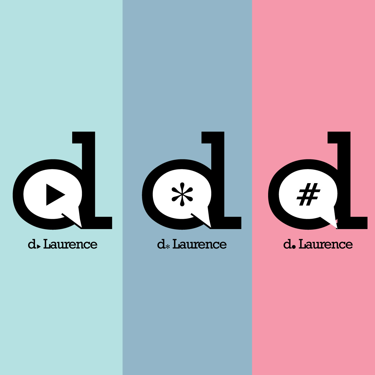
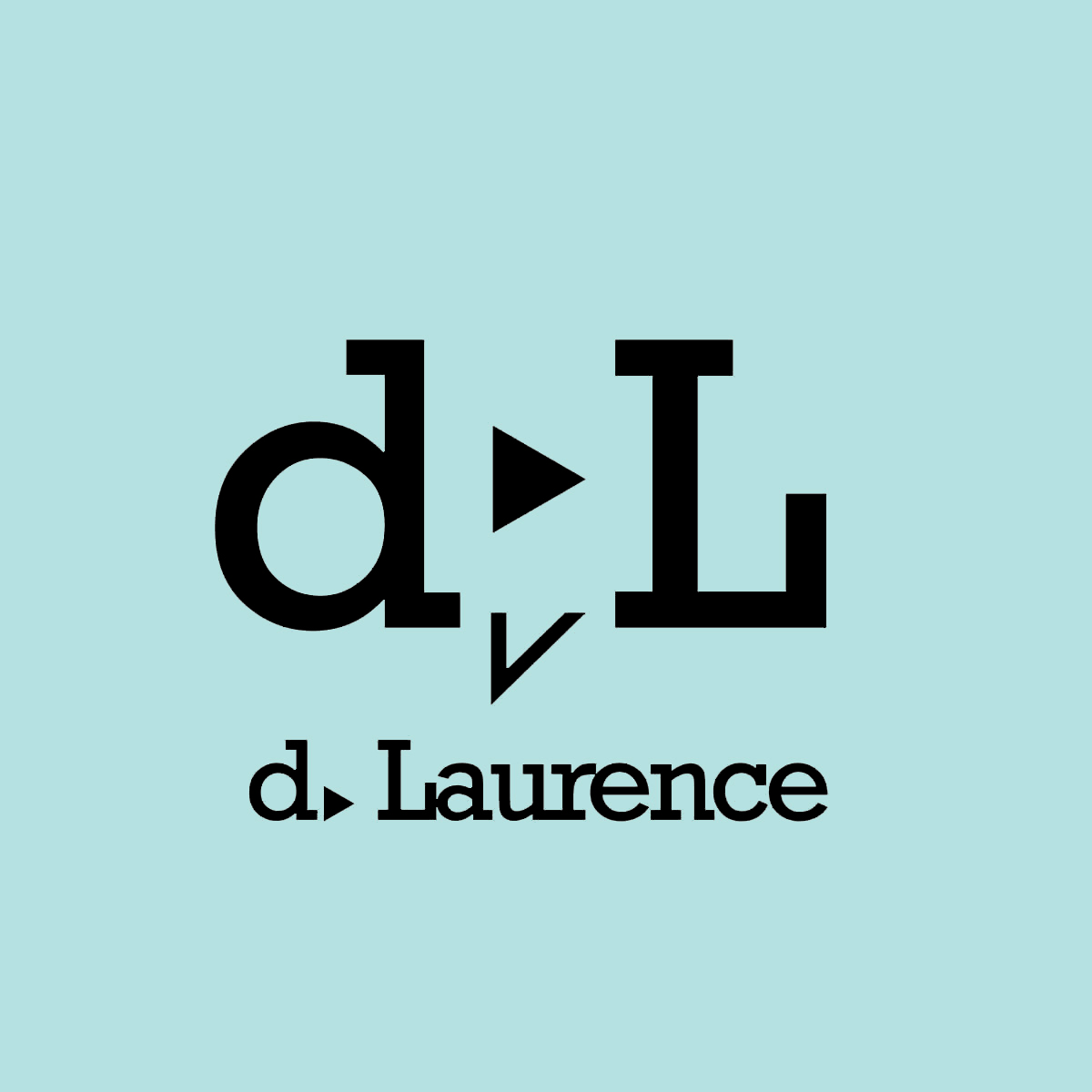
Carrying forward the visual concept established in the primary logo, a secondary logo was developed based on the elements of that logo, including the play button and speech bubble, with the form of the letters in the artist's initials functioning as part of the speech bubble. Those key graphic elements served as the anchor elements, carried throughout the identity system.
Project Summary A Visual Language
In a highly competitive profession where established artists and relationships dominate the landscape, this voice artist needed to stand out and deliver what sets her apart.
In addition to the elements of the logo being the foundation of the secondary logo, they were the foundation of all graphic elements of the identity system, working with the messaging to create a visual language that strengthened the message and conveyed the advantages a voice artist provides to brands and businesses. The project included the logo, identity system, business image, message, and writing, applied to business stationery, direct mail, and website development.

Project Photographer Identity
The project included the design of the logo, identity system, and business image for this talented photographer. The identity design and business image included the design of a responsive primary logo and identity system, responsive color palette, typography system, stationery system, and the business image.  View Project View Project |
Project Brand Development
The development of the Equanimous Practice brand included the design and development of the identity, the messaging, and the visual brand., Including the logo, tagline, messaging, statements, and the layouts for the business image for marketing and advertising. View Project |
Project Brand Development
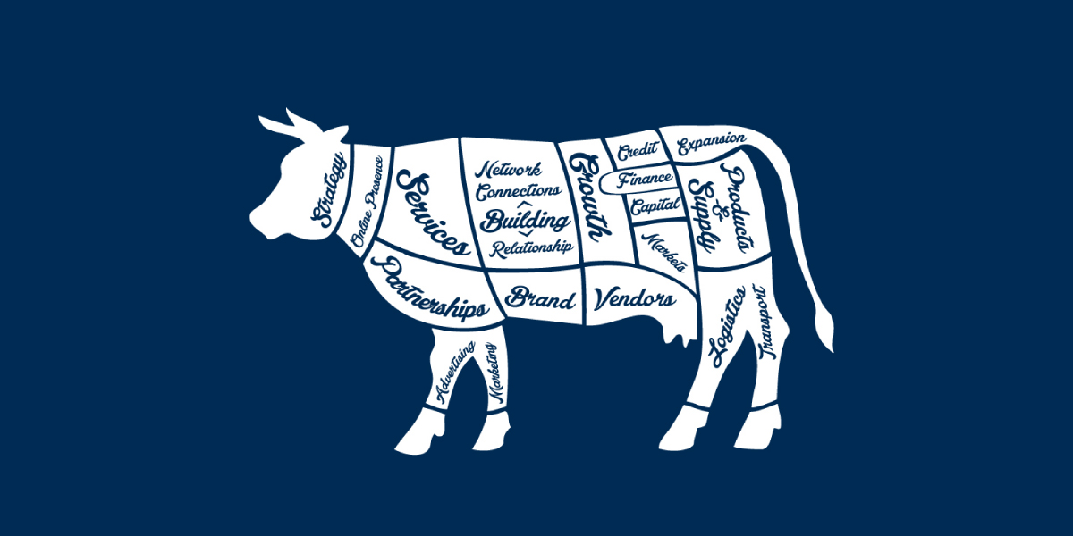
Victory is a business initiative and brand that connects clients, customers, and relevant businesses, to build a truly independent business ecosystem. The visual concept was based on the vintage butcher chart, to illustrate and communicate how businesses are connected with each other inside an industry, location, and relevant offerings. View Project |
Project Company Logo Redesign
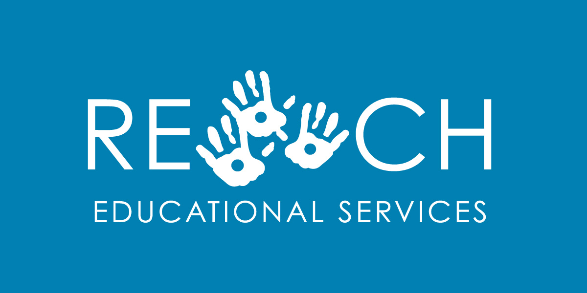
A provider of services, activities, support, and programs for children and children with developmental issues, the identity system design for the Reach Organization included a logo redesign based on an existing logo, to better convey the organization's mission. View Project |
Project Attorney Practice Identity
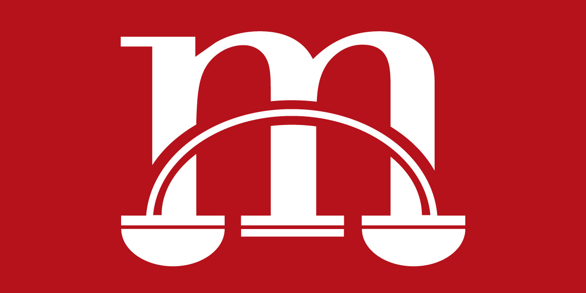
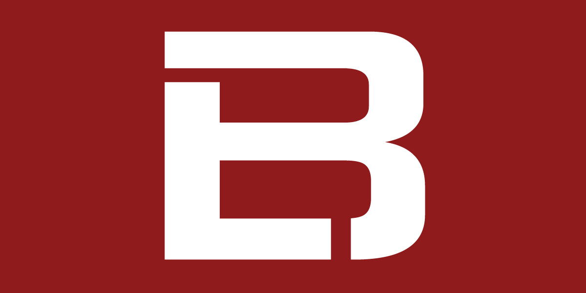
DDeveloped as part of the identity system and the foundation of the design language, this typographical logo incorporates the initial of the law firm's name with a visual elements that represents the scale of justice. As part of a comprehensive identity and firm image, the logo was applied to law firm messaging to create graphic elements, utilizing a bold color palette to work as a design element with the statements that reflect the law firm's beliefs, providing the law firm with a unique look to stand out in a competitive industry and geographic location.View Project
DDeveloped as part of the identity system and the foundation of the design language, this typographical logo incorporates the initial of the law firm's name with a visual elements that represents the scale of justice. As part of a comprehensive identity and firm image, the logo was applied to law firm messaging to create graphic elements, utilizing a bold color palette to work as a design element with the statements that reflect the law firm's beliefs, providing the law firm with a unique look to stand out in a competitive industry and geographic location.
View Project
Project Identity Design
A chapter of LeTip International, the identity development of this New Brunswick New Jersey LeTip chapter included a logo, identity system, and messaging, with the message and writing based on the benefits of membership.View Project
A chapter of LeTip International, the identity development of this New Brunswick New Jersey LeTip chapter included a logo, identity system, and messaging, with the message and writing based on the benefits of membership.
View Project
Project Identity Design and Naming
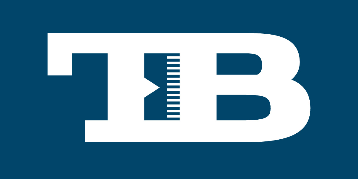
A consulting and advisory firm, Transformation Bureau provides their clients with advisory services centered around measurement, goals, and building client's business based on measurable results. That concept was incorporated into the naming of the business, the logo, and identity system.View Project
A consulting and advisory firm, Transformation Bureau provides their clients with advisory services centered around measurement, goals, and building client's business based on measurable results. That concept was incorporated into the naming of the business, the logo, and identity system.
View Project
Project Identity Design
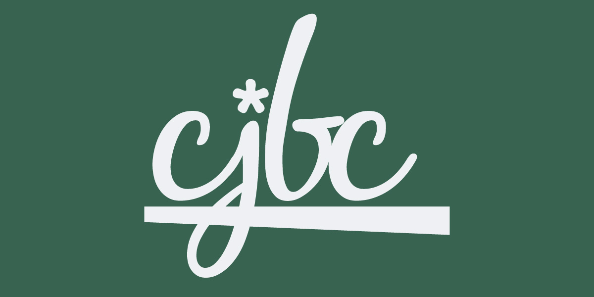
The logo design and identity development for Central Jersey Business Circle included a typographical-styled logo, secondary logo marks, a suite of graphic elements, typography, color palette, and business message, writing and statements.View Project
The logo design and identity development for Central Jersey Business Circle included a typographical-styled logo, secondary logo marks, a suite of graphic elements, typography, color palette, and business message, writing and statements.
View Project
Project Corporate Identity Redesign
With 42 years of equity behind the logo, the logo redesign needed to carry that equity forward into the new logo mark. The identity redesign and brand development included the logo, identity system, and company image across all platforms and mediums.View Project
With 42 years of equity behind the logo, the logo redesign needed to carry that equity forward into the new logo mark. The identity redesign and brand development included the logo, identity system, and company image across all platforms and mediums.
View Project

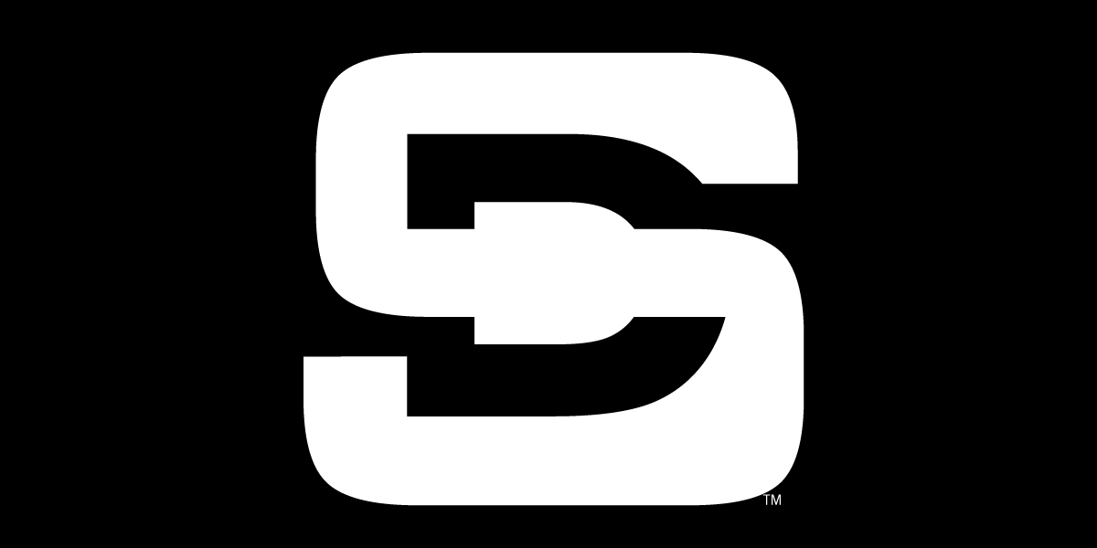
Project Identity Design
The logo design for Search Architects uses form, shape, and relevant visual elements to form a unique graphic element that represents the service provided and the function of the name, with the elements of the logo, including the typeface, applied to a secondary logo, wordmark and graphic elements that make up the identity system.View Project
The logo design for Search Architects uses form, shape, and relevant visual elements to form a unique graphic element that represents the service provided and the function of the name, with the elements of the logo, including the typeface, applied to a secondary logo, wordmark and graphic elements that make up the identity system.
View Project
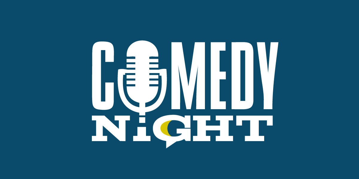
Project Event Poster and Event Brand
The Comedy Night event was an ongoing event held annually to raise money for, and awareness of the Reach Organization. The third event, this poster and corresponding design of marketing efforts was designed based on carrying forward and building on the look and feel of the first two posters to extend and build on the brand.View Project
The Comedy Night event was an ongoing event held annually to raise money for, and awareness of the Reach Organization. The third event, this poster and corresponding design of marketing efforts was designed based on carrying forward and building on the look and feel of the first two posters to extend and build on the brand.
View Project
Project Swimwear Brand Identity
SnapMe Swimwear creates clothing, apparel, and swimwear for babies, toddlers and children, making days by the pool and at the beach easier through product features and innovative product design. The project included the logo redesign and comprehensive identity system, with the developed identity system applied to product visuals and materials to help differentiate products and product line.View Project
SnapMe Swimwear creates clothing, apparel, and swimwear for babies, toddlers and children, making days by the pool and at the beach easier through product features and innovative product design. The project included the logo redesign and comprehensive identity system, with the developed identity system applied to product visuals and materials to help differentiate products and product line.
View Project
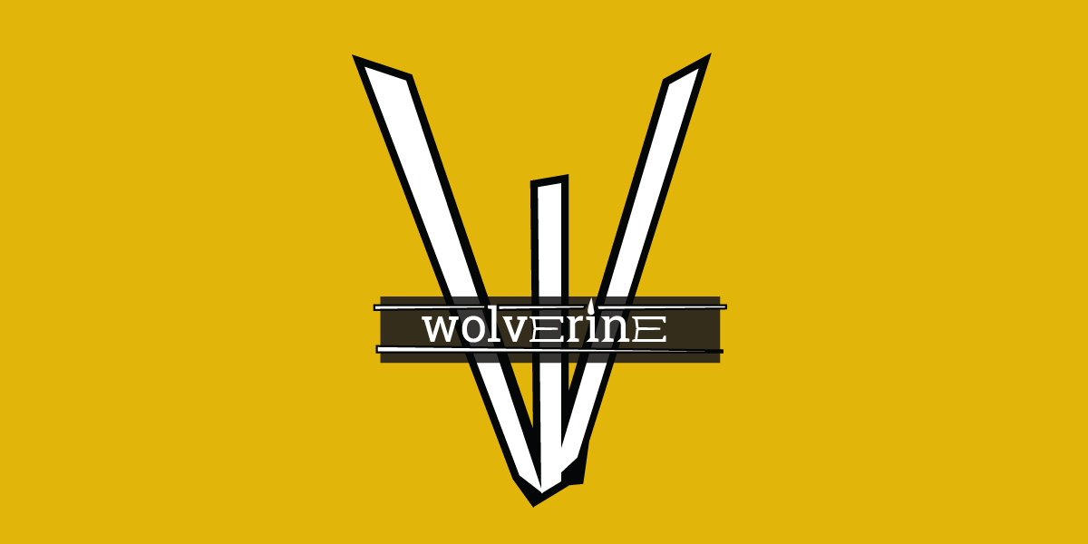
Project Identity Design
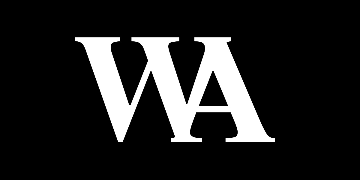
Developed to convey strength, non trade-specific, and work in multiple industries, this logo mark relies on typography as the major design element. The identity system is comprised of the primary logo, icon, wordmark-like graphic, and color palette, the letter W within the logo and identity system represent the animal's claw or the wounds from the claw, a concept carried throughout the identity system.View Project
Developed to convey strength, non trade-specific, and work in multiple industries, this logo mark relies on typography as the major design element. The identity system is comprised of the primary logo, icon, wordmark-like graphic, and color palette, the letter W within the logo and identity system represent the animal's claw or the wounds from the claw, a concept carried throughout the identity system.
View Project
Project Logo Design & Identity
Logo design and identity design work for businesses, brands, and independent professionals, ranging from industrial doors, pet services, insurance companies, creatives, and attorneys, from graphics only to typographical namemarks, from single logo to comprehensive identity systems.View Project
Logo design and identity design work for businesses, brands, and independent professionals, ranging from industrial doors, pet services, insurance companies, creatives, and attorneys, from graphics only to typographical namemarks, from single logo to comprehensive identity systems.
View Project
Project Tradesmen Logos
In professions, trades, and industries saturated with heavy competition, with and abundance of choice for the consumer, the logo, identity, and business image is essential for contractors, masons, electricians, painters, and other professionals heavily saturated with competition and choice. Compelling logo design and business image is essential and ensures the business stands out and thought of first when customers need their services.View Project
In professions, trades, and industries saturated with heavy competition, with and abundance of choice for the consumer, the logo, identity, and business image is essential for contractors, masons, electricians, painters, and other professionals heavily saturated with competition and choice. Compelling logo design and business image is essential and ensures the business stands out and thought of first when customers need their services.
View Project
Project Typographical Logo Design
Often called a wordmark, lettermark, monogram or logotype, a typographical logo incorporates relevant visual elements into initials, a letter, or the written word to create a logo or graphic element within an identity system. Ranging from a visual choice to a strategic decision for a business industry saturated with competition, this approach ensures the name and the product or service provided is represented one visual element.View Project
Often called a wordmark, lettermark, monogram or logotype, a typographical logo incorporates relevant visual elements into initials, a letter, or the written word to create a logo or graphic element within an identity system. Ranging from a visual choice to a strategic decision for a business industry saturated with competition, this approach ensures the name and the product or service provided is represented one visual element.
View Project
Select Case Studies
The select project case studies and in-depth examination of strategy, approach, process, and the development of creative that provides the solutions clients need to build their brand, establish the presence of their business, generates revenue, strengthens online visibility, and evolves the creative that ensures their brand is fresh and relevant in markets saturated with competition.view case studies
The select project case studies and in-depth examination of strategy, approach, process, and the development of creative that provides the solutions clients need to build their brand, establish the presence of their business, generates revenue, strengthens online visibility, and evolves the creative that ensures their brand is fresh and relevant in markets saturated with competition.
view case studies
Recent Projects
The recent work and latest projects from Adam Garlinger, including building an online brand, carrying forward and applying and existing brand into a new brand, and building on the established value to generate revenue, in projects that include campaign development, building a brand and the development of a website under a brand umbrella.view recent projects
The recent work and latest projects from Adam Garlinger, including building an online brand, carrying forward and applying and existing brand into a new brand, and building on the established value to generate revenue, in projects that include campaign development, building a brand and the development of a website under a brand umbrella.
view recent projects
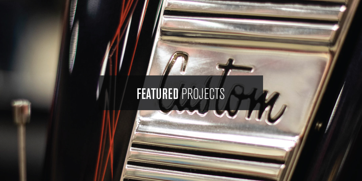
Featured Projects & Work
The featured projects and works of Adam Garlinger, with projects that include brand development, building a product offering, business ecosystem development, visual branding, campaign design, website development, creative process, and the brand evolution of a renamed business.view the featured projects
The featured projects and works of Adam Garlinger, with projects that include brand development, building a product offering, business ecosystem development, visual branding, campaign design, website development, creative process, and the brand evolution of a renamed business.
view the featured projects
Located in New Jersey where Washington crossed the Delaware into New Jersey to win the war, Design Solutions Adam Garlinger is an advertising and design studio that helps clients differentiate their business from those they compete with...to stand out, be seen, and be remembered.
Delivering the first impression their business needs to accelerate the return on investment that is their business.
38 River Drive, Titusville New Jersey | adam@adamgarlinger.com
38 River Drive, Titusville New Jersey | adam@adamgarlinger.com
Design Solutions Adam Garlinger | 908.581.3393
 |
 |
 |
 |
 |
 |