


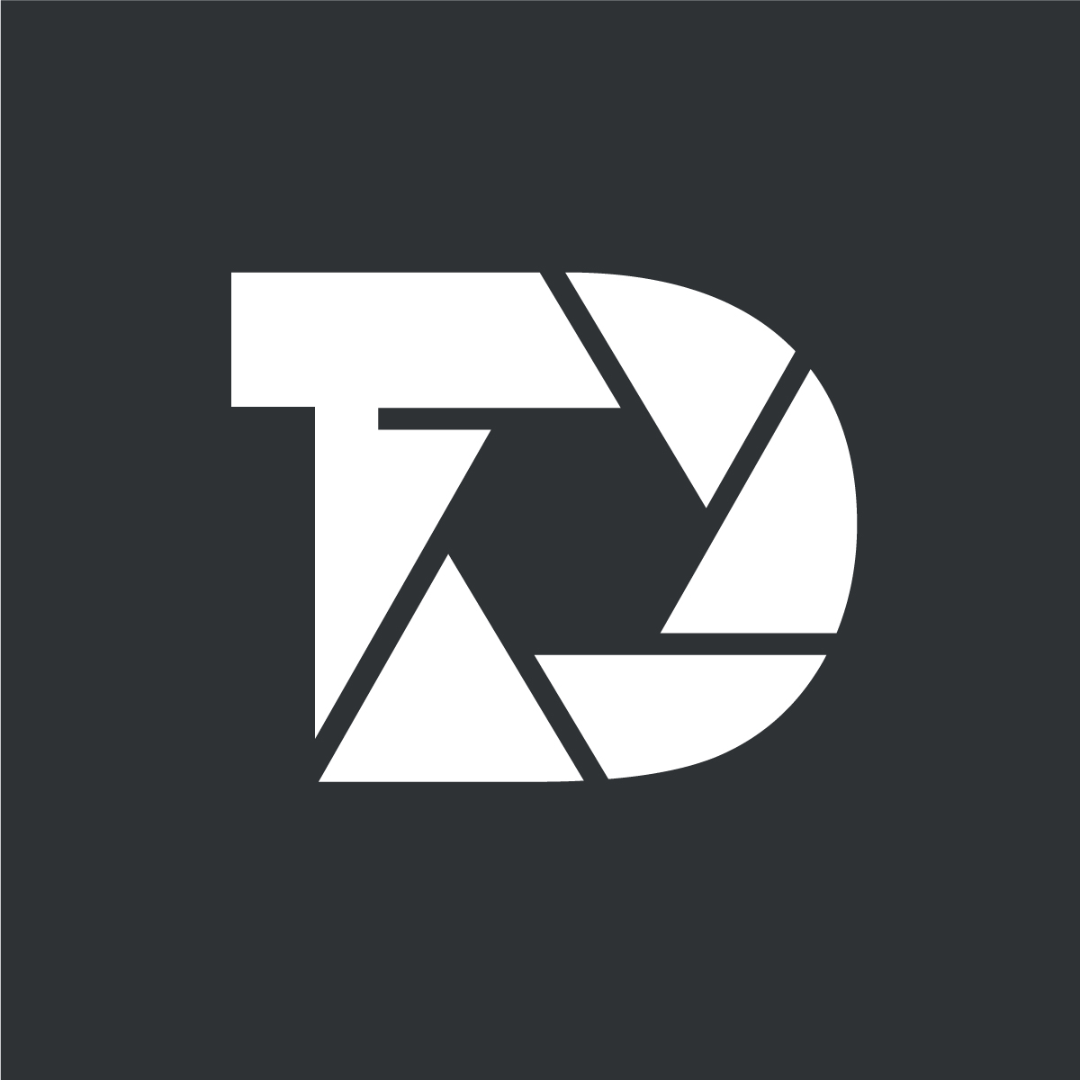
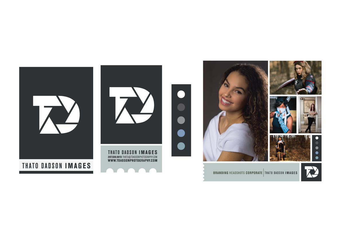
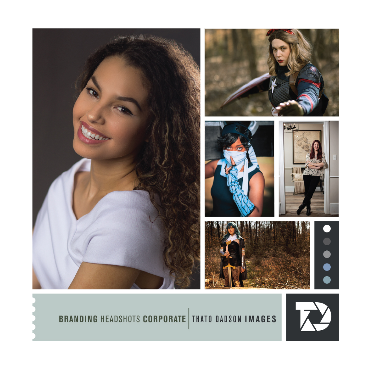
Identity Design / Thato Dadson Images
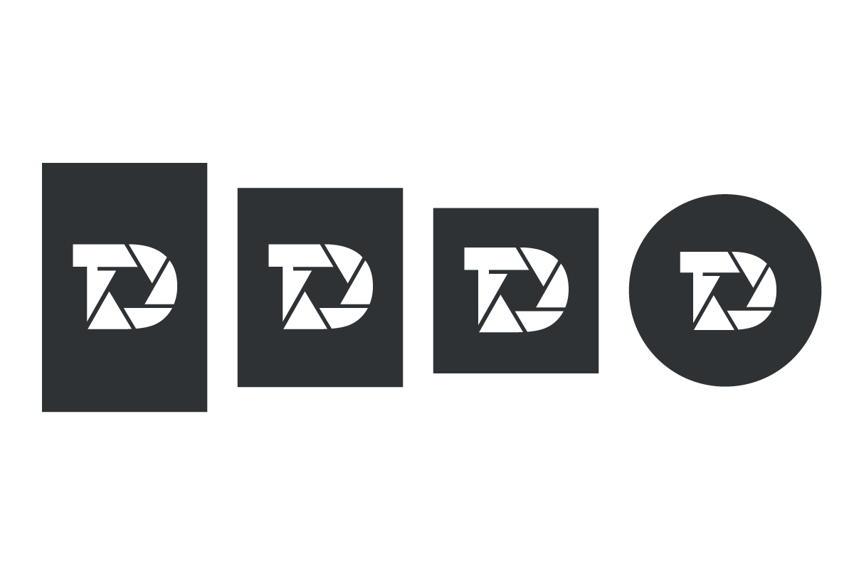
The project included the design of the logo, identity system, and business image for this talented photographer. The identity design and business image included the design of a responsive primary logo and identity system, responsive color palette, typography system, stationery system, and the business image.
The development of the logo was crafted to be responsive from the start, using shape, form, color, and typography to achieve the responsive functionality. The logo's graphic uses alternate holding shapes that ensure it works in all visual and spatial real estate. This approach provides the photographer with greater flexibility in layouts, mediums, and platforms in business communications
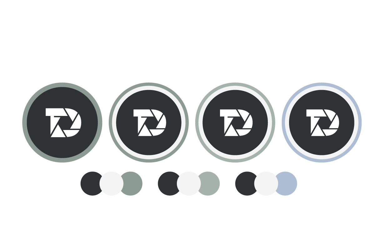
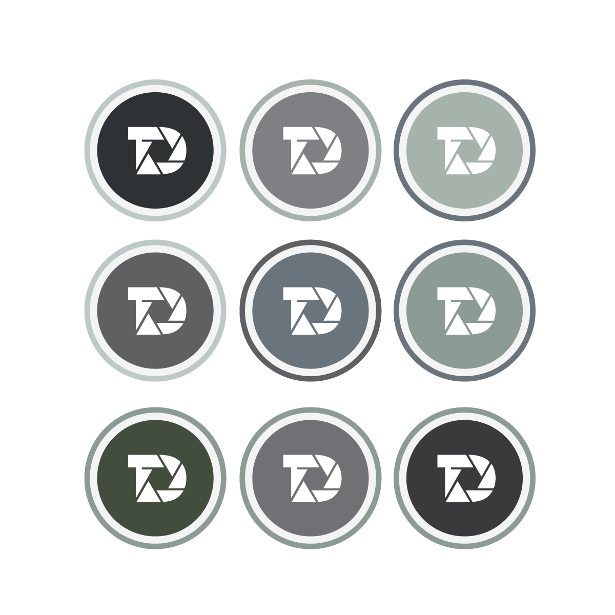
Achieving an essential business goal through the design approach, the color grey and color palette ensures the logo does not compete for attention with the photographer’s images, using the color palette to achieve this set goal. The grey color scheme ensures the logo and identity system does not conflict with the color in the photographs., More importantly this approach ensures the photographer's work is always the main visual focus wherever the business is represented.
The actual design of the logo was based on incorporating the photographer's initials of T and D with visuals relevant to photography to establish a quick connection with the viewer.
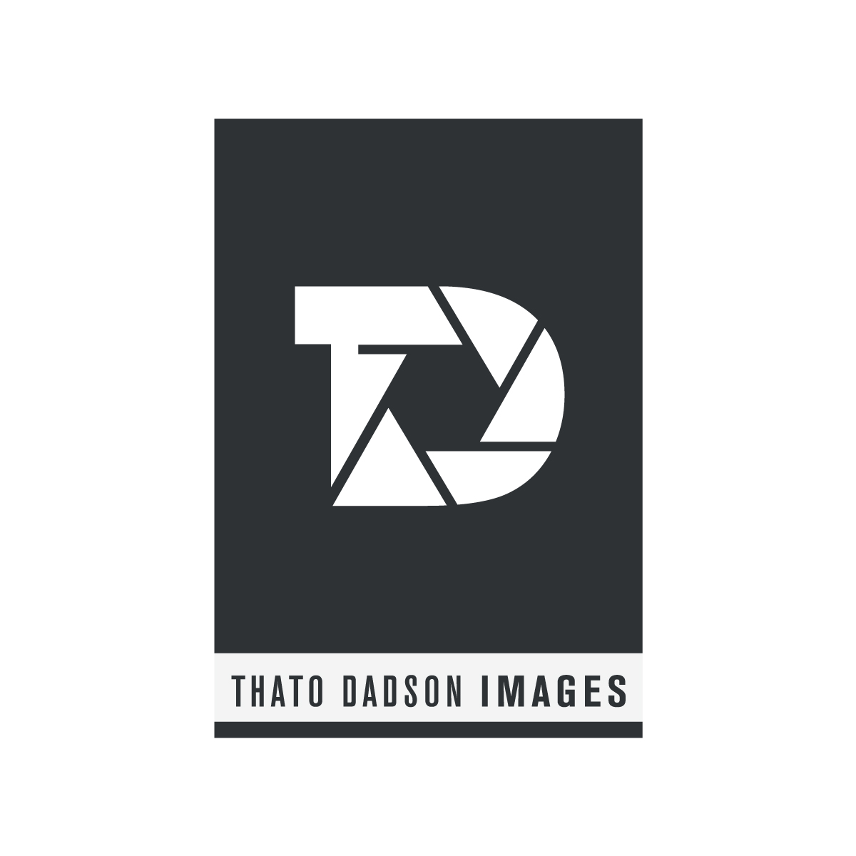
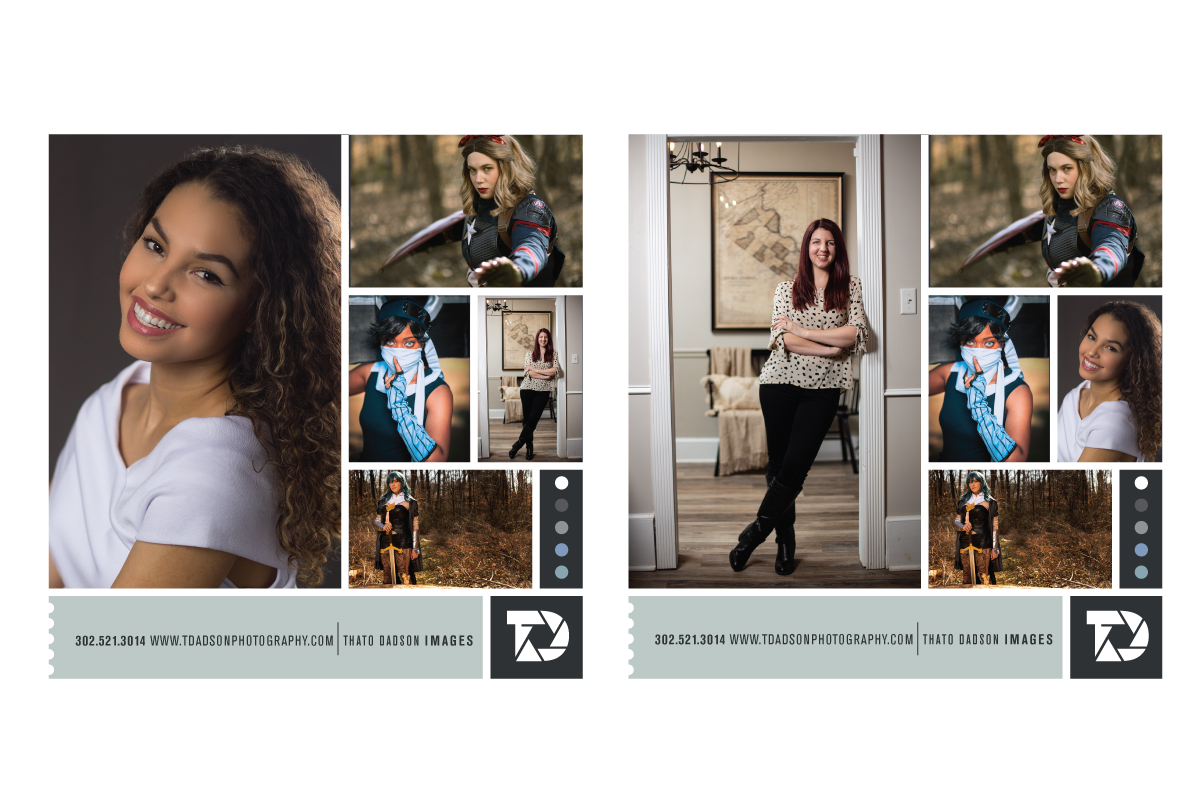
Logo & Identity Design
The project included the design of the logo, identity system, and business image for this talented photographer. The identity design and business image included the design of a responsive primary logo and identity system, responsive color palette, typography system, stationery system, and the business image.
The development of the logo was crafted to be responsive from the start, using shape, form, color, and typography to achieve the responsive functionality. The logo's graphic uses alternate holding shapes that ensure it works in all visual and spatial real estate. This approach provides the photographer with greater flexibility in layouts, mediums, and platforms in business communications
Achieving an essential business goal through the design approach, the color grey and color palette ensures the logo does not compete for attention with the photographer’s images, using the color palette to achieve this set goal. The grey color scheme ensures the logo and identity system does not conflict with the color in the photographs., More importantly this approach ensures the photographer's work is always the main visual focus wherever the business is represented.
The actual design of the logo was based on incorporating the photographer's initials of T and D with visuals relevant to photography to establish a quick connection with the viewer.

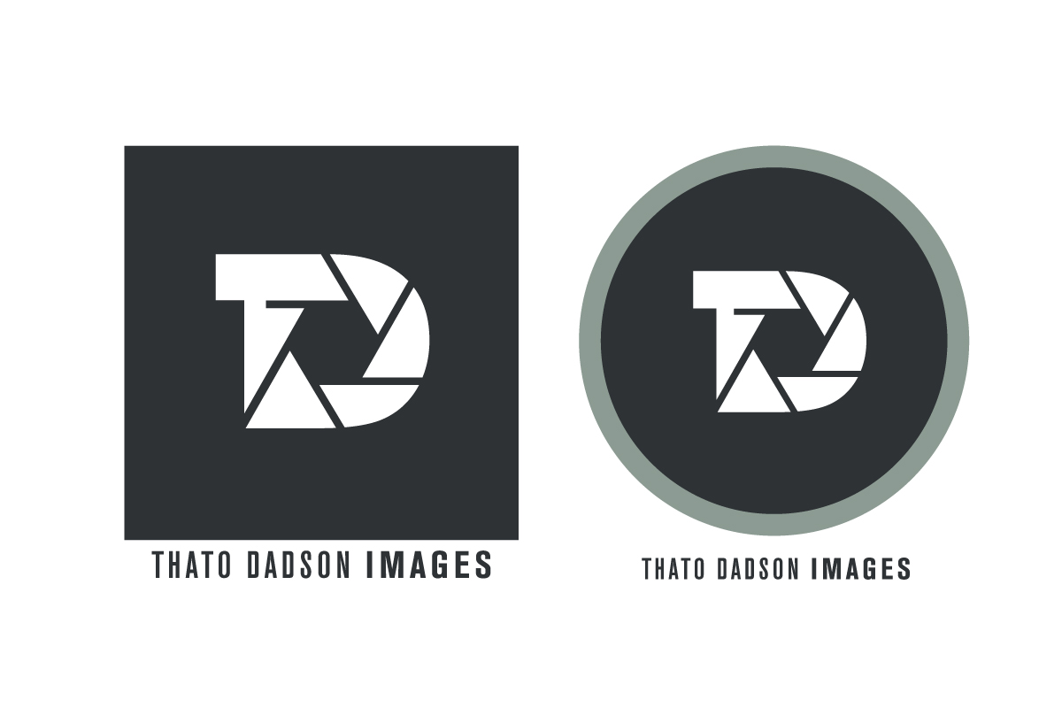
Project Summary & Notes
The logo was intended to be responsive from the start, using shape, color, and typography to achieve the responsive gain of function, ensuring the logo does not conflict with colors in the photographer’s images, using alternate shaped versions of the logo that ensures it works in all spatial real estate. The grey color ensures the logo does not conflict with the photographs and works with the color in the photographs., More importantly this approach ensures the photographer's work stays the main focus whenever the business is represented.
The logo was intended to be responsive from the start, using shape, color, and typography to achieve the responsive gain of function, ensuring the logo does not conflict with colors in the photographer’s images, using alternate shaped versions of the logo that ensures it works in all spatial real estate. The grey color ensures the logo does not conflict with the photographs and works with the color in the photographs., More importantly this approach ensures the photographer's work stays the main focus whenever the business is represented.

Brand Signature Advisors
Starting with the development of the business brand through to the website development, the project included the identity design, company image, messaging, writing, design system, website development, the components for the company's online presence, and brand guidelines. View Project
Starting with the development of the business brand through to the website development, the project included the identity design, company image, messaging, writing, design system, website development, the components for the company's online presence, and brand guidelines.
View Project
Identity Design R&R Landscaping
Logo and identity design for R&R Landscaping Inc.. The identity design included the primary logo, a secondary identity for smaller spaces, and a typeset version of the logo. In full color, one color, and version for dark backgrounds.View Project
Logo and identity design for R&R Landscaping Inc.. The identity design included the primary logo, a secondary identity for smaller spaces, and a typeset version of the logo. In full color, one color, and version for dark backgrounds.
View Project
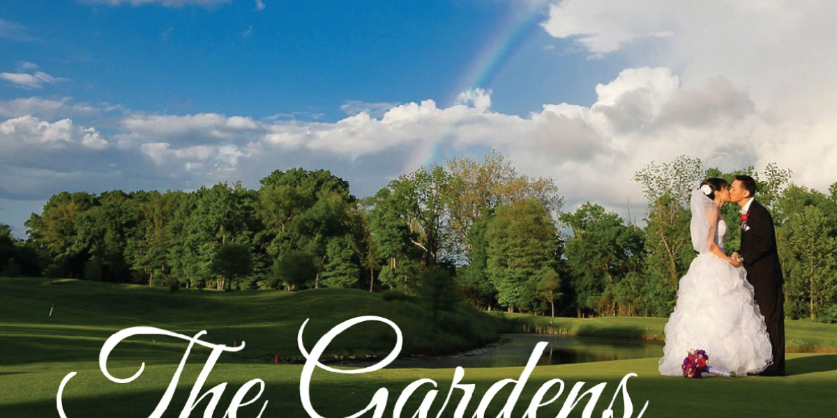
Website The Gardens at Applecross
The Gardens at Applecross is the second location of this wedding brand in Pennsylvania. The website development included carrying forward and building on the established brand into the design, writing, and messaging.View Project
The Gardens at Applecross is the second location of this wedding brand in Pennsylvania. The website development included carrying forward and building on the established brand into the design, writing, and messaging.
View Project
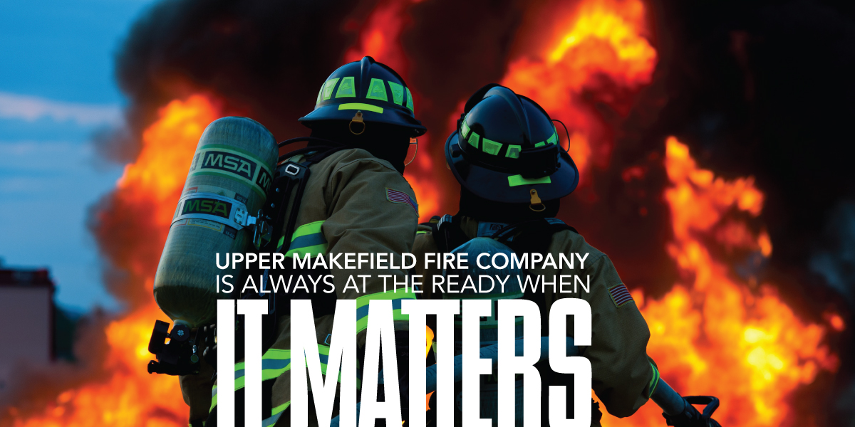
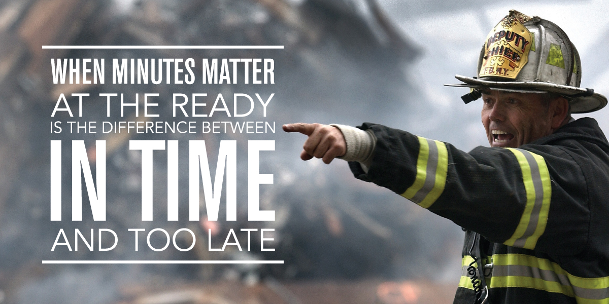
Design Upper Makefield Fire Co.
For the fourth straight year the Upper Makefield Fire Company hired Adam Garlinger to design their annual fundraising. A campaign to raise funds for the Fire Company’s operational needs, continued training, and education. As in previous years, the project development included the campaign concept, messaging, writing, and design, and layout of the mailer package.View Project
For the fourth straight year the Upper Makefield Fire Company hired Adam Garlinger to design their annual fundraising. A campaign to raise funds for the Fire Company’s operational needs, continued training, and education. As in previous years, the project development included the campaign concept, messaging, writing, and design, and layout of the mailer package.
View Project
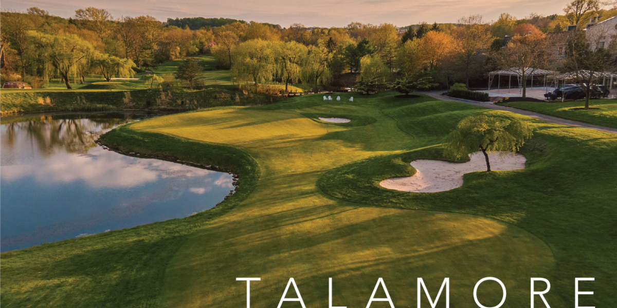
Website Talamore Pennsylvania
Talamore Pennsylvania serves as the flagship website for the Talamore Family of Clubs. In addition to being the primary club brand online hub, the website is intended to showcase the offerings, including weddings, social events, mitzvahs, golf outings, and corporate events. In addition to representing the brand, the goal was to effectively showcase each of the offerings within the site. To achieve both representing the brand and the offerings equally, the graphics, color, typography, photography, and writing played an essential role to that goal.View Project
Talamore Pennsylvania serves as the flagship website for the Talamore Family of Clubs. In addition to being the primary club brand online hub, the website is intended to showcase the offerings, including weddings, social events, mitzvahs, golf outings, and corporate events. In addition to representing the brand, the goal was to effectively showcase each of the offerings within the site. To achieve both representing the brand and the offerings equally, the graphics, color, typography, photography, and writing played an essential role to that goal.
View Project
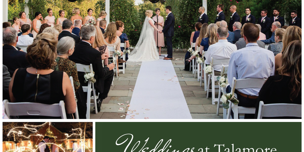
Website Weddings at Talamore
Visual brand and website development for Weddings at Talamore, a key offering in the Talamore suite of offerings. Developed on the Wordpress platform, the writing and design of the website was essential in the representation of the Talamore offering; the surroundings, grounds, amenities, features and the unique options of the wedding offering. With the event photography being an essential element of the Talamore weddings brand.View Project
Visual brand and website development for Weddings at Talamore, a key offering in the Talamore suite of offerings. Developed on the Wordpress platform, the writing and design of the website was essential in the representation of the Talamore offering; the surroundings, grounds, amenities, features and the unique options of the wedding offering. With the event photography being an essential element of the Talamore weddings brand.
View Project
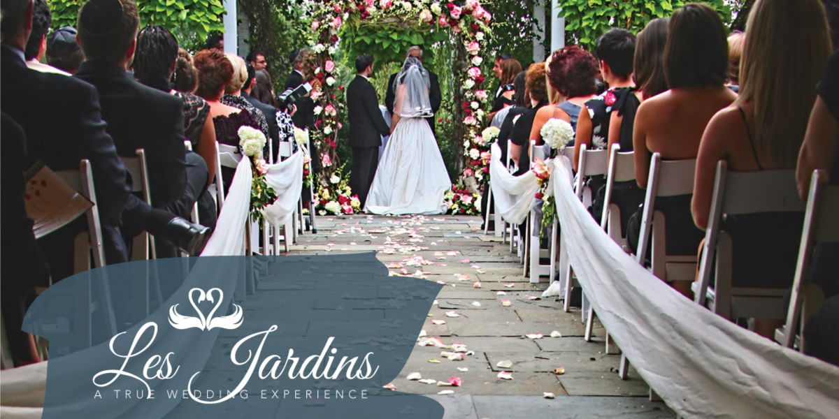
Brand & Website Design Les Jardins
The project included the development of the Les Jardins brand, writing, messaging, and the development of a responsive website. Originally developed as an html website, the site was later redeveloped in Wordpress as a visual replication of the original site. Building the value from the elements that included the unique offerings, experience of staff, amenities, and the beauty of the grounds, the brand development incorporated the value, differentiators, competitive advantage.View Project
The project included the development of the Les Jardins brand, writing, messaging, and the development of a responsive website. Originally developed as an html website, the site was later redeveloped in Wordpress as a visual replication of the original site. Building the value from the elements that included the unique offerings, experience of staff, amenities, and the beauty of the grounds, the brand development incorporated the value, differentiators, competitive advantage.
View Project
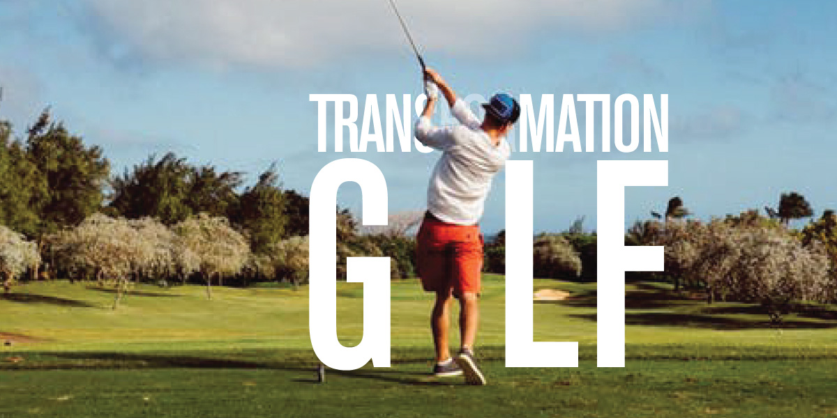
Visual Brand Transformation Golf
The project included the logo design, identity system, messaging, and the development of the business image, then applied to the website, online advertising, social media, and marketing materials. The identity system includes the logo, secondary logo, wordmark, suite of icons and graphic elements that conveys the brand’s value proposition and differentiators. In the development of the brand and company image, the tagline, messaging, and statements were developed into graphic elements, then incorporated into layouts to create the company image.View Project
The project included the logo design, identity system, messaging, and the development of the business image, then applied to the website, online advertising, social media, and marketing materials. The identity system includes the logo, secondary logo, wordmark, suite of icons and graphic elements that conveys the brand’s value proposition and differentiators. In the development of the brand and company image, the tagline, messaging, and statements were developed into graphic elements, then incorporated into layouts to create the company image.
View Project
Identity Design Talamore
Logo redesign and club identity system for the Talamore Family of Clubs, located throughout the United States, designed to incorporate the club’s offerings and services into a system of visual elements that work as one with the overall club brand.View Project
Logo redesign and club identity system for the Talamore Family of Clubs, located throughout the United States, designed to incorporate the club’s offerings and services into a system of visual elements that work as one with the overall club brand.
View Project
Campaign Upper Makefield Fire Co.
Again asked to create the fundraising campaign for the Upper Makefield Fire Company, the development of this years campaign was based on building their value and highlighting their importance to the community. As the concept and creative for the prior year's campaign had been developed, the project began with the development of the concept and message, applied to the development of the look and feel. As in the previous year's campaign, the concept and message communicated the importance of the fire company within the community without guilting the reader, or making claims that overplay the fire company.View Project
Again asked to create the fundraising campaign for the Upper Makefield Fire Company, the development of this years campaign was based on building their value and highlighting their importance to the community. As the concept and creative for the prior year's campaign had been developed, the project began with the development of the concept and message, applied to the development of the look and feel. As in the previous year's campaign, the concept and message communicated the importance of the fire company within the community without guilting the reader, or making claims that overplay the fire company.
View Project
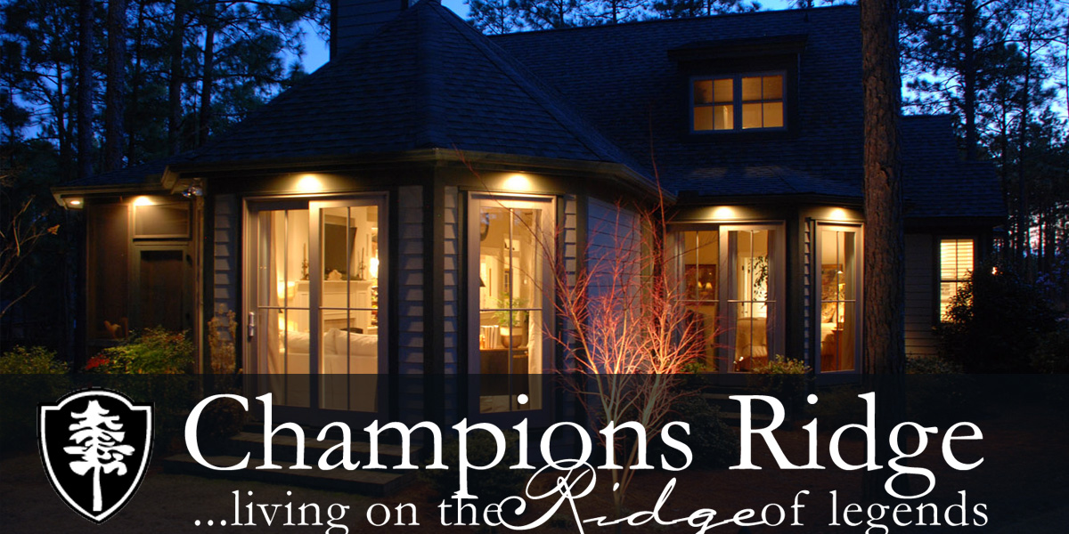
Website Design Champions Ridge
Located in Pinehurst North Carolina, an area rich in traditions and immersed in the lifestyle of golf, Champions Ridge is a development of homes and planned community, located in close proximity to the legendary Mid South Club. This online brand and website development needed to reflect these elements as well as showcase the homes and showcase the developed community. The project development included the development of the online brand and business image, messaging, writing, website design and development.View Project
Located in Pinehurst North Carolina, an area rich in traditions and immersed in the lifestyle of golf, Champions Ridge is a development of homes and planned community, located in close proximity to the legendary Mid South Club. This online brand and website development needed to reflect these elements as well as showcase the homes and showcase the developed community. The project development included the development of the online brand and business image, messaging, writing, website design and development.
View Project

Business Image Design Hale Built
A respected and well-known name within the construction industry, Hale Built has been providing specialty construction services since 1946. The company provides house raising services, and now foundation repair. With the foundation repair services positioned as a company under the Hale brand, the goal was to carry forward the brand and elements of the other company site into this site developed for foundation repair services, while developing a unique look and feel, and a brand message that conveys the differentiator and value proposition of this new business.View Project
A respected and well-known name within the construction industry, Hale Built has been providing specialty construction services since 1946. The company provides house raising services, and now foundation repair. With the foundation repair services positioned as a company under the Hale brand, the goal was to carry forward the brand and elements of the other company site into this site developed for foundation repair services, while developing a unique look and feel, and a brand message that conveys the differentiator and value proposition of this new business.
View Project
Select Projects
The projects and work of Adam Garlinger, including logo design, business identity, and brand development for clients that include attorneys, insurance companies, networking, advisors, consultants, voice artists, and underwriters who are rebranding their corporation, building their business, and establishing a strong business presence. It's not only what we do, but how we do it.view projects
The projects and work of Adam Garlinger, including logo design, business identity, and brand development for clients that include attorneys, insurance companies, networking, advisors, consultants, voice artists, and underwriters who are rebranding their corporation, building their business, and establishing a strong business presence. It's not only what we do, but how we do it.
view projects
Select Case Studies
The select project case studies and in-depth examination of strategy, approach, process, and the development of creative that provides the solutions clients need to build their brand, establish the presence of their business, generates revenue, strengthens online visibility, and evolves the creative that ensures their brand is fresh and relevant in markets saturated with competition.view case studies
The select project case studies and in-depth examination of strategy, approach, process, and the development of creative that provides the solutions clients need to build their brand, establish the presence of their business, generates revenue, strengthens online visibility, and evolves the creative that ensures their brand is fresh and relevant in markets saturated with competition.
view case studies
Featured Projects & Work
The featured projects and works of Adam Garlinger, with projects that include brand development, building a product offering, business ecosystem development, visual branding, campaign design, website development, creative process, and the brand evolution of a renamed business.view the featured projects
The featured projects and works of Adam Garlinger, with projects that include brand development, building a product offering, business ecosystem development, visual branding, campaign design, website development, creative process, and the brand evolution of a renamed business.
view the featured projects
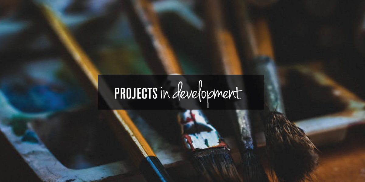
Projects in Development
From various ongoing projects that are in development to various graphic elements from within those projects. This includes logo and identity design, graphics, icons, and visual elements in all phases of the project development.view the projects in development
From various ongoing projects that are in development to various graphic elements from within those projects. This includes logo and identity design, graphics, icons, and visual elements in all phases of the project development.
view the projects in development
Located in New Jersey where Washington crossed the Delaware into New Jersey to win the war, Design Solutions Adam Garlinger is an advertising and design studio that helps clients differentiate their business from those they compete with...to stand out, be seen, and be remembered.
Delivering the first impression their business needs to accelerate the return on investment that is their business.
38 River Drive, Titusville New Jersey | adam@adamgarlinger.com
38 River Drive, Titusville New Jersey | adam@adamgarlinger.com
Design Solutions Adam Garlinger | 908.581.3393
 |
 |
 |
 |
 |
 |