


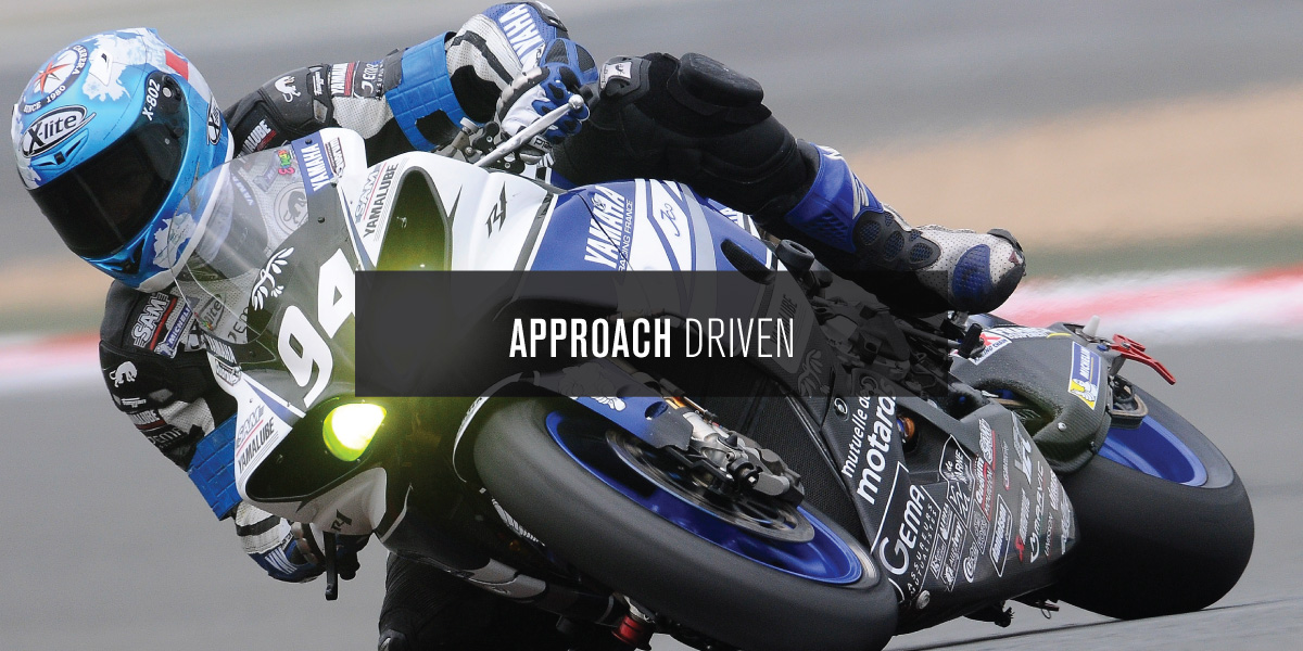
Brand Development
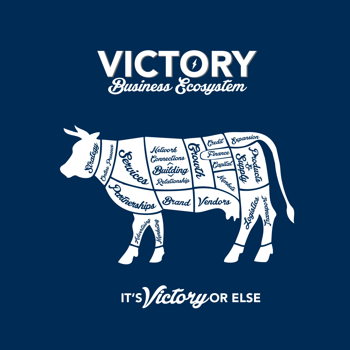
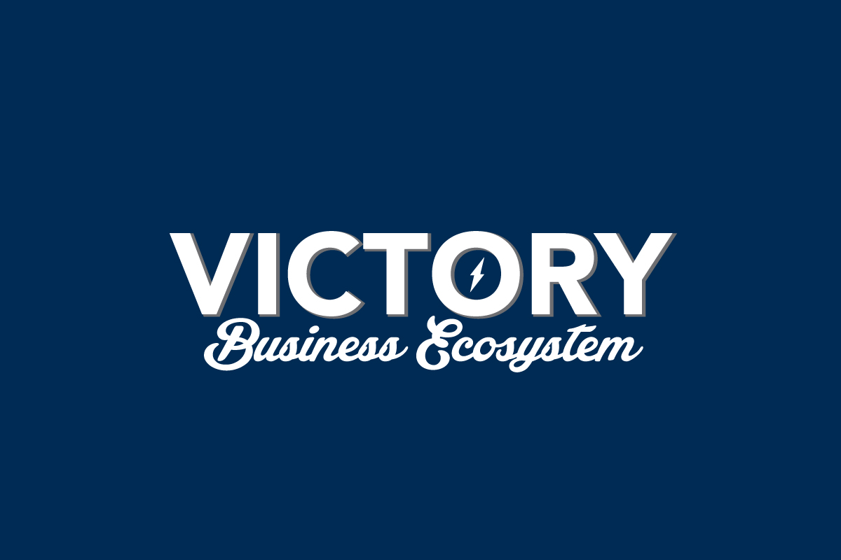
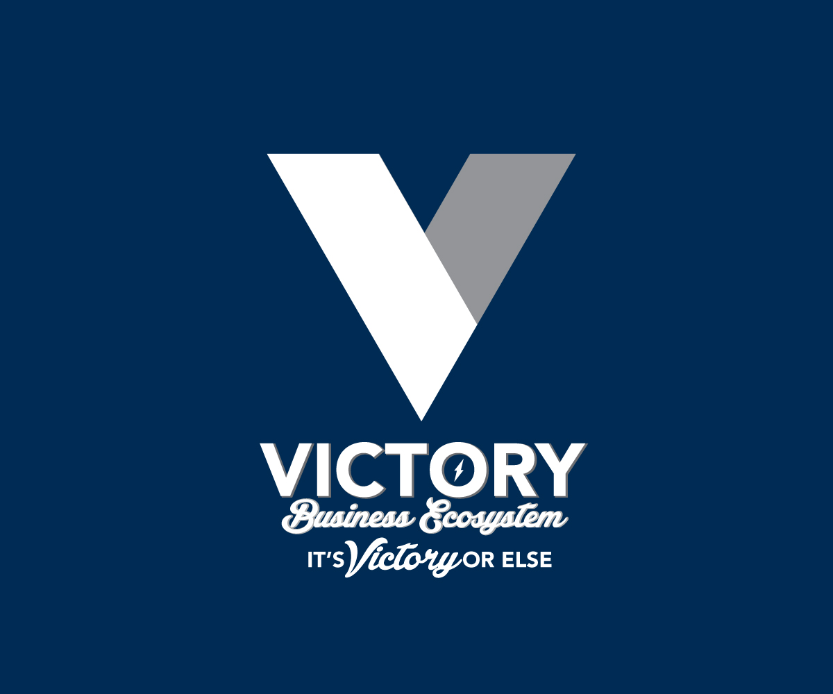
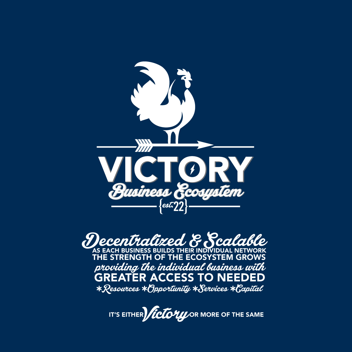
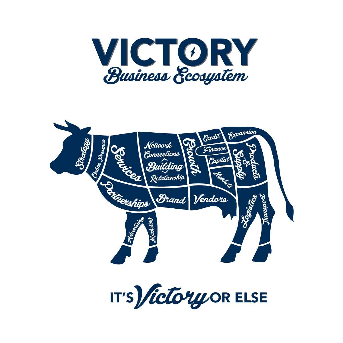
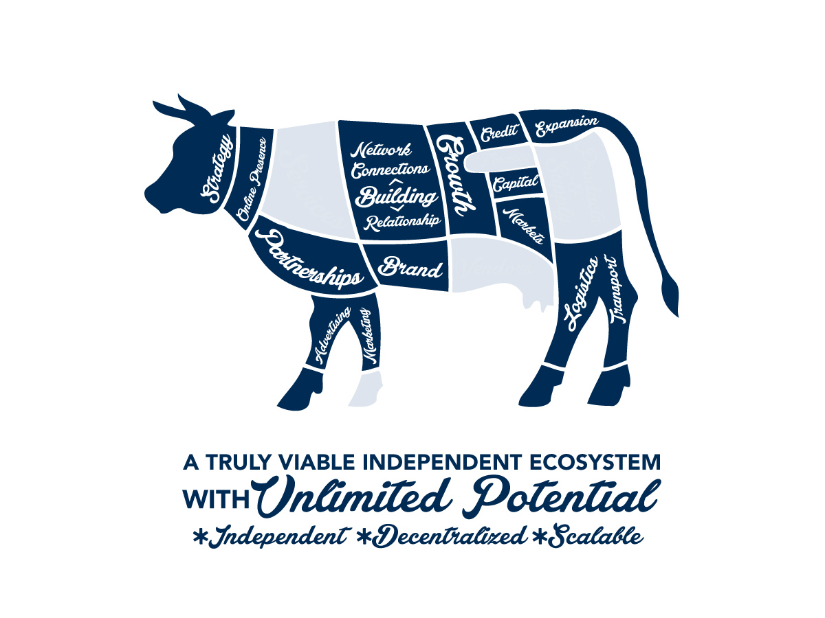
Victory is an independent business development offering that connects businesses to clients, customers, and to other relevant businesses, building an independent business ecosystem. The original idea was based on local food professionals, including farms, butchers, markets, and other businesses within that community. But it was quickly apparent it could serve a wider audience and address a greater need. Victory was then developed to work across the whole of the independent business community, with the architecture of Victory enabling it to be applied to multiple industries, professions, and trades.
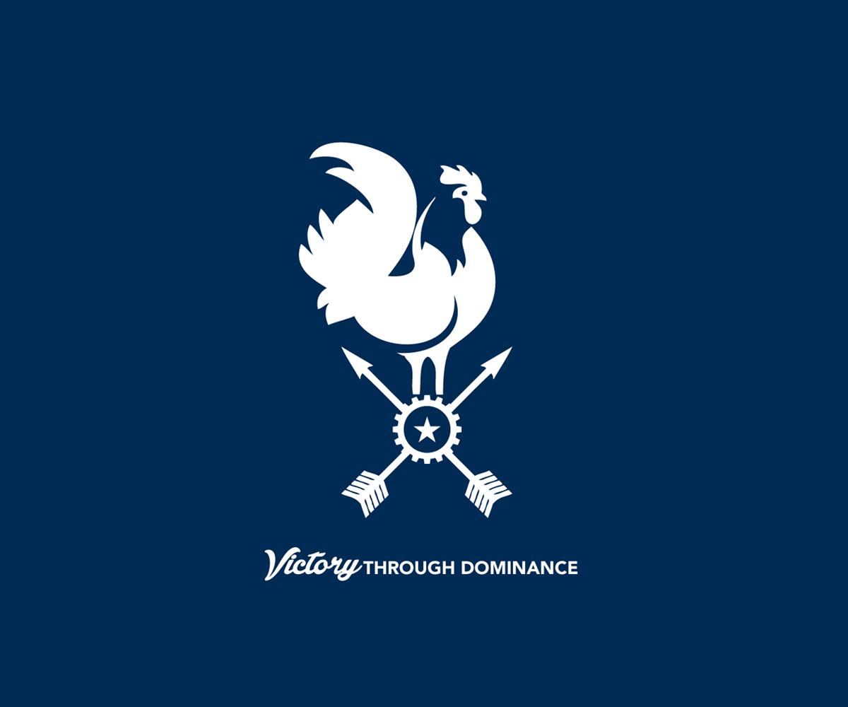
The visual concept is based on the vintage butcher's chart of different cuts of meat from sections of an animal, developed to represent elements within a business ecosystem, industry, or business, where all those elements are connected and interdependent.
Within the visual development, the butcher's chart illustration had two roles, one; The illustration was used to convey the interdependent elements within a business ecosystem, industry, or a business itself. In the second role; the blocks in the chart were used to illustrate the disappearance of independent, local and small businesses., As the continual disappearance of businesses is the secondary subject of the initiative.
The concept, illustration, graphics, and the writing has the flexibility to be repurposed as needed; applied to the elements within an industry, businesses within that industry, specific businesses, and community, and issues specific to professions, trades, or industry.
Within the Victory visual brand development, the blue and white color palette conveys the intended feel, and allows the graphic elements to be the focus of attention.
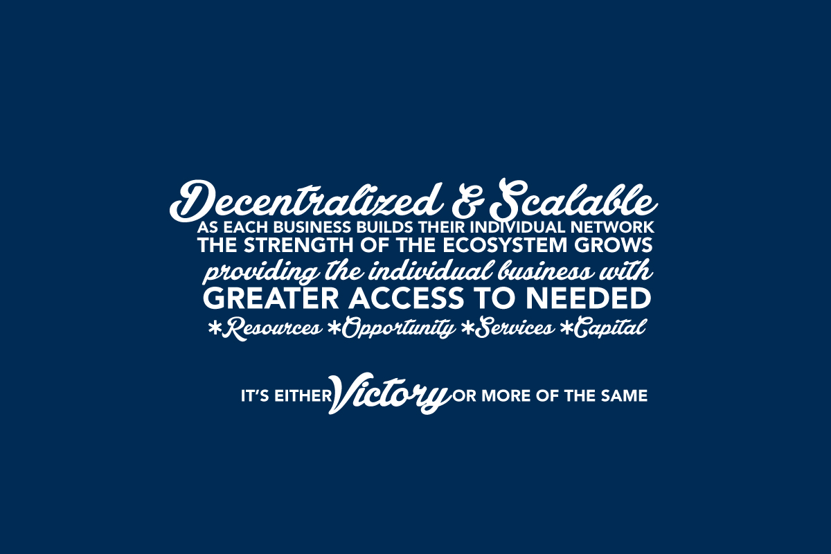
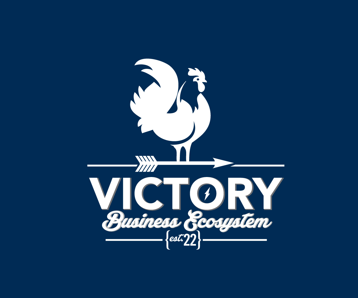
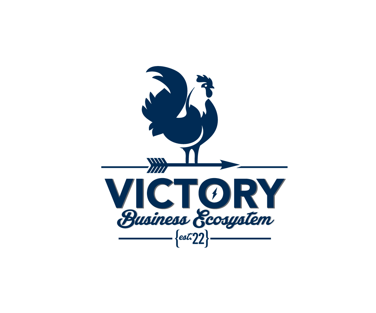
The design architecture enables the primary visual element, the butcher’s chart illustration, to be applied to multiple professions, trades, and industries. In addition to the butcher’s chart illustration, additional graphics like the rooster illustrations convey the “Old Americana” look and feel, with the Victory wordmark conveying strength. The vintage “Old Americana” tone, look, and feel was achieved through the design, color palette, and typography, with all elements working together to establish the feel.
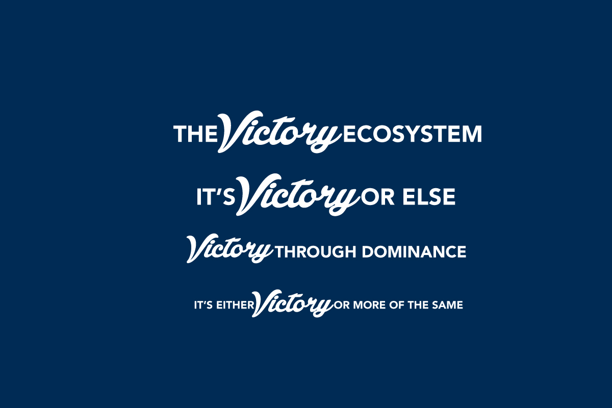
The architecture of Victory enables it to be applied to multiple industries, professions, and trades, enabling it to be repurposed and scaled. The graphic elements, writing, and messaging remain consistent in any repurposing, with messaging, statements and wordings able to be changed as needed. +To view the Victory Ecosystem website, click here.
The Victory Ecosystem
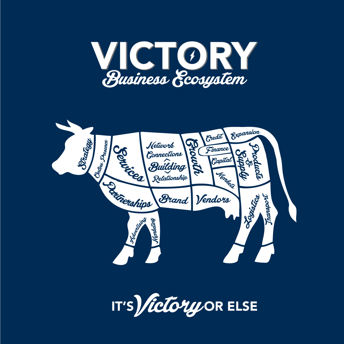
Victory is an independent business development offering that connects businesses to clients, customers, and to other relevant businesses, building an independent business ecosystem. The original idea was based on local food professionals, including farms, butchers, markets, and other businesses within that community. But it was quickly apparent it could serve a wider audience and address a greater need. Victory was then developed to work across the whole of the independent business community, with the architecture of Victory enabling it to be applied to multiple industries, professions, and trades.
The visual concept is based on the vintage butcher's chart of different cuts of meat from sections of an animal, developed to represent elements within a business ecosystem, industry, or business, where all those elements are connected and interdependent.
Within the visual development, the butcher's chart illustration had two roles, one; The illustration was used to convey the interdependent elements within a business ecosystem, industry, or a business itself. In the second role; the blocks in the chart were used to illustrate the disappearance of independent, local and small businesses., As the continual disappearance of businesses is the secondary subject of the initiative.
The concept, illustration, graphics, and the writing has the flexibility to be repurposed as needed; applied to the elements within an industry, businesses within that industry, specific businesses, and community, and issues specific to professions, trades, or industry.
Within the Victory visual brand development, the blue and white color palette conveys the intended feel, and allows the graphic elements to be the focus of attention.
The design architecture enables the primary visual element, the butcher’s chart illustration, to be applied to multiple professions, trades, and industries. In addition to the butcher’s chart illustration, additional graphics like the rooster illustrations convey the “Old Americana” look and feel, with the Victory wordmark conveying strength. The vintage “Old Americana” tone, look, and feel was achieved through the design, color palette, and typography, with all elements working together to establish the feel.
The architecture of Victory enables it to be applied to multiple industries, professions, and trades, enabling it to be repurposed and scaled. The graphic elements, writing, and messaging remain consistent in any repurposing, with messaging, statements and wordings able to be changed as needed. +To view the Victory Ecosystem website, click here.

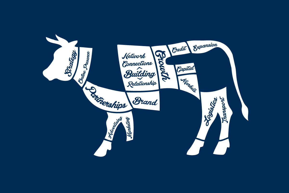
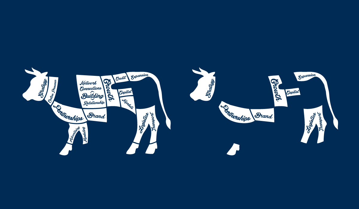
Project Notes Victory
Representing the concept of duality, action and outcome, the developed creative illustrated the connected interdependent elements, and the disappearance of those elements. With the ability to be repurposed, the graphic elements are able to represent industry, businesses, elements of a business, or a multitude of other subjects. Working with the flexibility, the graphic elements, writing, and messaging are able to be repurposed as needed, and stay within brand.
Representing the concept of duality, action and outcome, the developed creative illustrated the connected interdependent elements, and the disappearance of those elements. With the ability to be repurposed, the graphic elements are able to represent industry, businesses, elements of a business, or a multitude of other subjects. Working with the flexibility, the graphic elements, writing, and messaging are able to be repurposed as needed, and stay within brand.

Brand Development DaVinci
The project included the design of the medical practice brand, including the business image, identity, and copywriting. The development of the Practice brand included the business value, differentiators, competitive advantage, and value proposition, applied into the writing, messaging, and concept used to create the business image. View Project
The project included the design of the medical practice brand, including the business image, identity, and copywriting. The development of the Practice brand included the business value, differentiators, competitive advantage, and value proposition, applied into the writing, messaging, and concept used to create the business image.
View Project
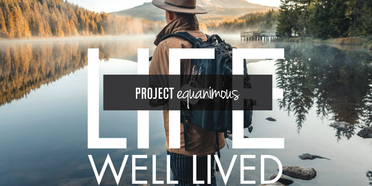
Brand Development Equanimous
The development of the Equanimous Practice brand included the design and development of the identity, the messaging, and the visual brand., Including the logo, tagline, messaging, statements, and the layouts for the business image for marketing and advertising.View Project
The development of the Equanimous Practice brand included the design and development of the identity, the messaging, and the visual brand., Including the logo, tagline, messaging, statements, and the layouts for the business image for marketing and advertising.
View Project
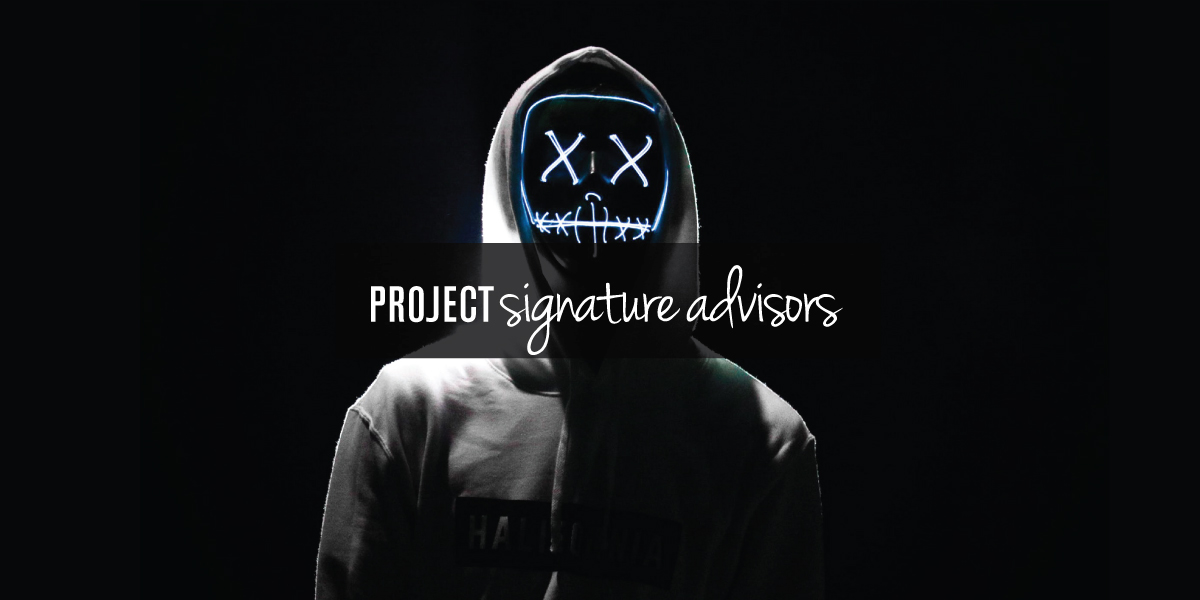
Brand Development Signature Advisors
Starting with the development of the brand through to the development of the website, the project included the identity design, company image, messaging, writing, design system, website development, the components for the company's online presence, and brand guidelines. The project also included strategies for the maintenance of the site, and to continually strengthen the online visibility of the website.View Project
Starting with the development of the brand through to the development of the website, the project included the identity design, company image, messaging, writing, design system, website development, the components for the company's online presence, and brand guidelines. The project also included strategies for the maintenance of the site, and to continually strengthen the online visibility of the website.
View Project
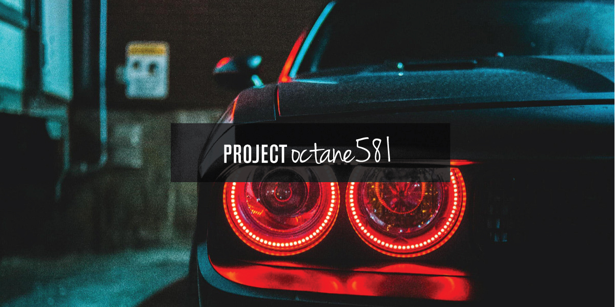
Brand Development Octane581
Octane581 is a complete communication solution for clients in all professions, trades, and industries. Building from a deep value formula, cultivated from the client’s developed business value. Octane581 is tailored to the client's business, within the industry they operate in. The development of the Octane581 brand included the concept, design, writing, messaging, development, and architecture.View Project
Octane581 is a complete communication solution for clients in all professions, trades, and industries. Building from a deep value formula, cultivated from the client’s developed business value. Octane581 is tailored to the client's business, within the industry they operate in. The development of the Octane581 brand included the concept, design, writing, messaging, development, and architecture.
View Project
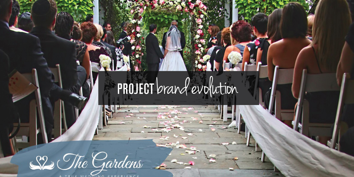
Brand Evolution The Gardens
With the business renamed, the established brand needed to be carried forward, incorporating the equity it had built over the years. A new location was also being added which needed to be incorporated into the website, with an update to the website layout, content structure, and website architecture.View Project
With the business renamed, the established brand needed to be carried forward, incorporating the equity it had built over the years. A new location was also being added which needed to be incorporated into the website, with an update to the website layout, content structure, and website architecture.
View Project
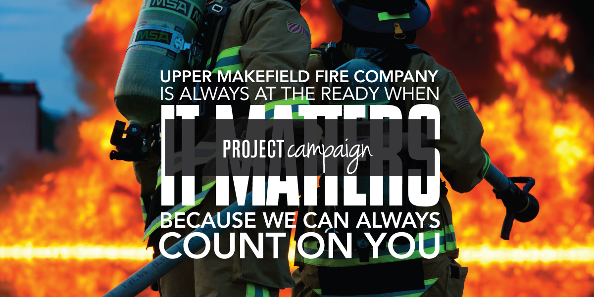
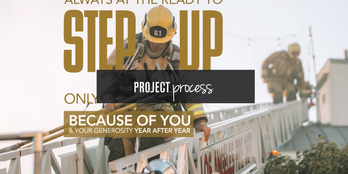
Campaign Design Upper Makefield
For the fourth straight year the Upper Makefield Fire Company hired Adam Garlinger to design their annual fundraising. A campaign to raise funds for the Fire Company’s operational needs, continued training, and education. As in previous years, the project development included the campaign concept, messaging, writing, and design, and layout of the mailer package.View Project
For the fourth straight year the Upper Makefield Fire Company hired Adam Garlinger to design their annual fundraising. A campaign to raise funds for the Fire Company’s operational needs, continued training, and education. As in previous years, the project development included the campaign concept, messaging, writing, and design, and layout of the mailer package.
View Project
Development Creative Process
Starting the creative process, words and imagery, establishing the tone and feel of the messaging and imagery, the writing and the design are done together, as part of the initial creative process, with statements written out to create a feel for what the messaging will say and how it will be said.View Project
Starting the creative process, words and imagery, establishing the tone and feel of the messaging and imagery, the writing and the design are done together, as part of the initial creative process, with statements written out to create a feel for what the messaging will say and how it will be said.
View Project
Located in New Jersey where Washington crossed the Delaware into New Jersey to win the war, Design Solutions Adam Garlinger is an advertising and design studio that helps clients differentiate their business from those they compete with...to stand out, be seen, and be remembered.
Delivering the first impression their business needs to accelerate the return on investment that is their business.
38 River Drive, Titusville New Jersey | adam@adamgarlinger.com
38 River Drive, Titusville New Jersey | adam@adamgarlinger.com
Design Solutions Adam Garlinger | 908.581.3393
 |
 |
 |
 |
 |
 |