


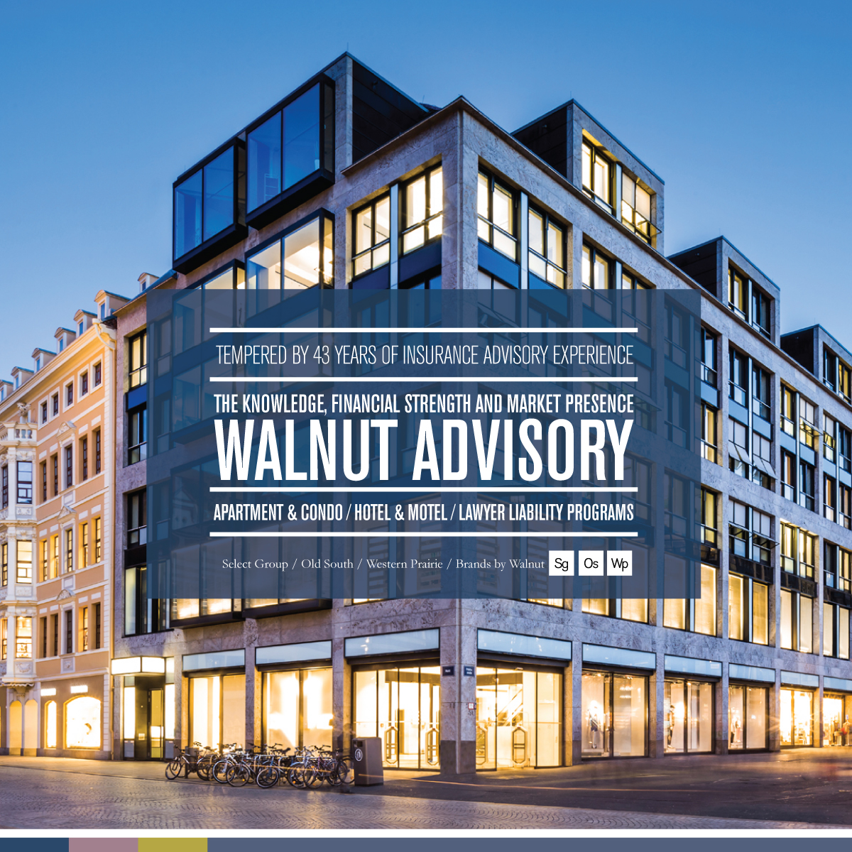
Identity, Message & Company Image Case Study
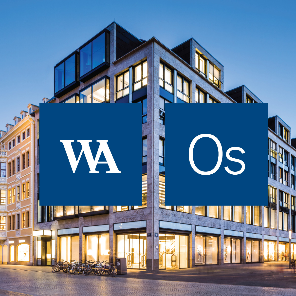
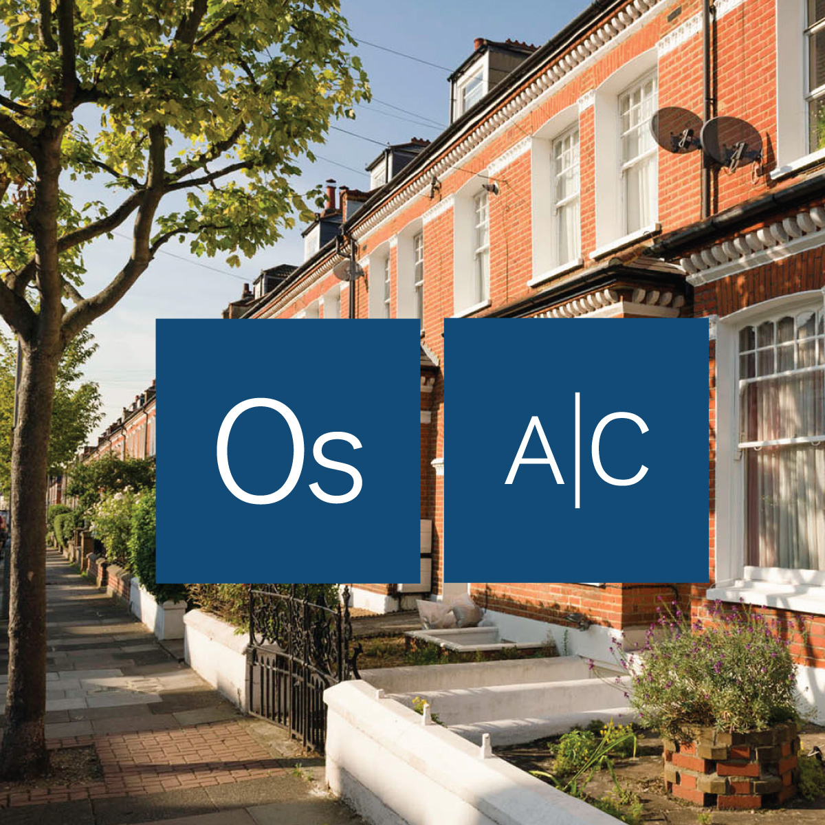
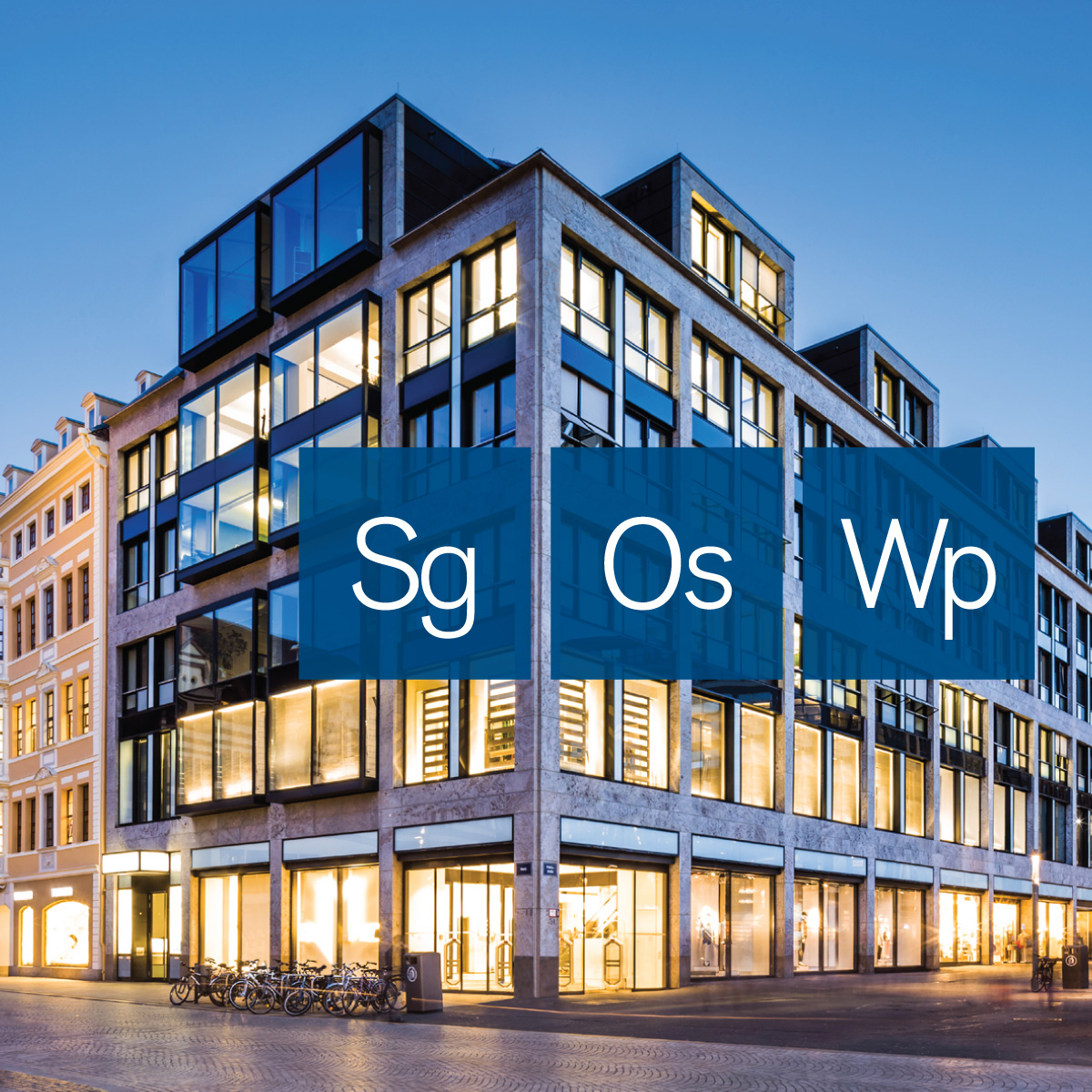
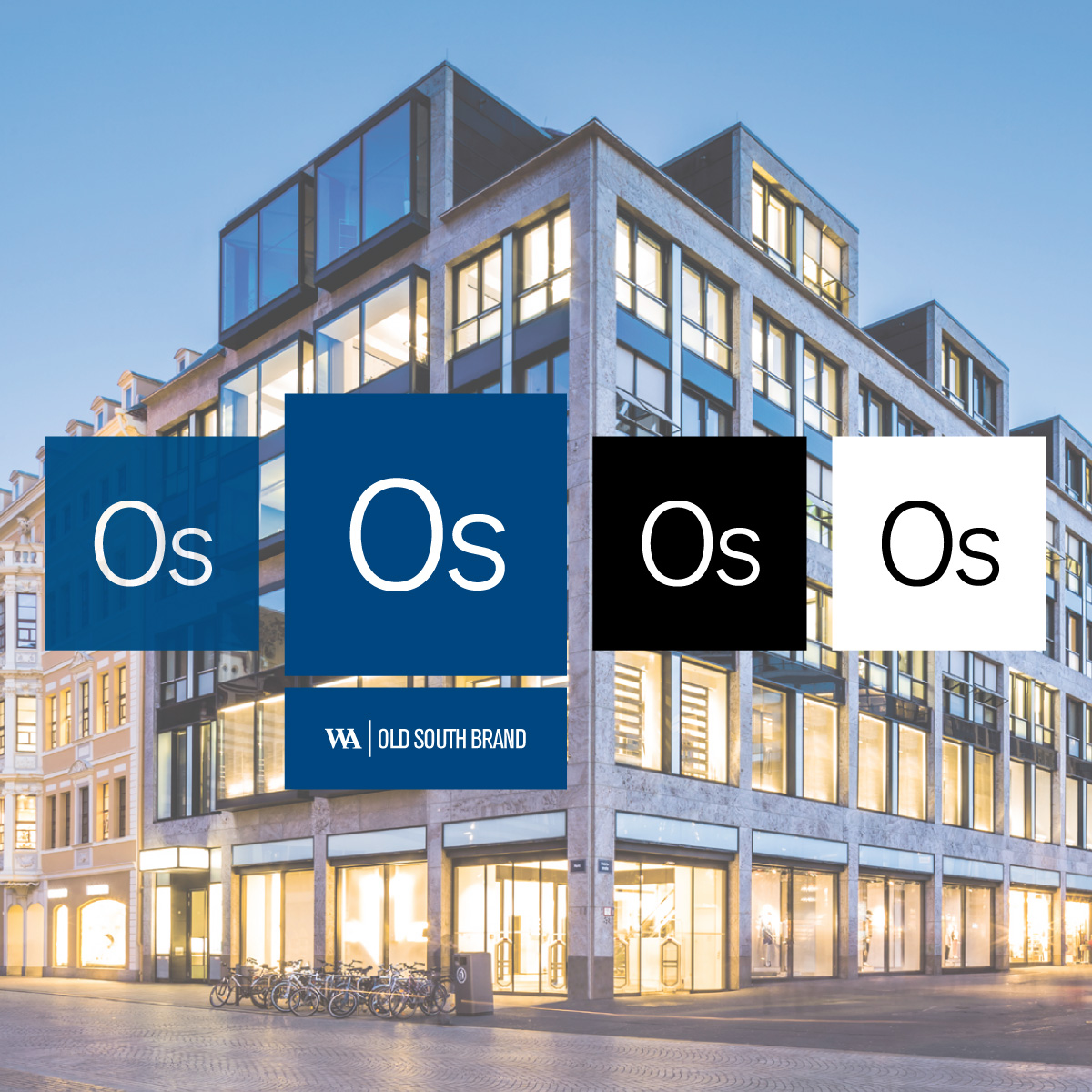
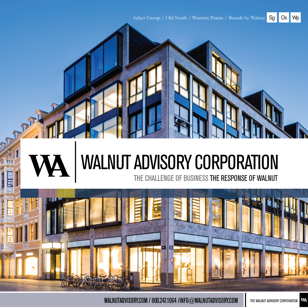
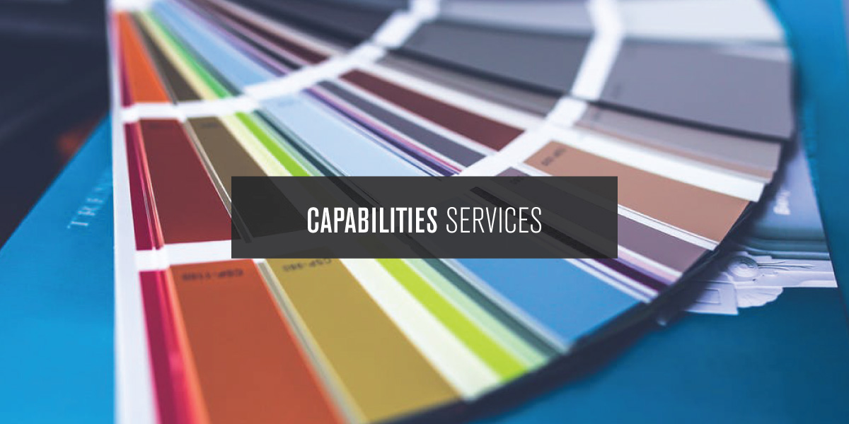
Incorporating the value-driven brand architecture and structure of offerings into the purpose and the approach, the development of the identity system and company image included the logo redesign, secondary versions of the logo, suite of icons, color palette, typography palette, graphic lockups and the design of layouts. Developed to represent the company programs and brands, the icons were used to visually convey the structure of offerings and represent the brand value, and work with the messaging in the creative to showcase the brand value.
Because the programs and brands of Walnut were conveyed as elements-of Walnut, or parts of the whole, the creative approach and design of the icons played an homage to the periodic table of elements. In addition to the elements-of aspect, typography was the design approach, and the icons visually complimented and added-to the logo. The icons were a signature visual element in the layouts, tying all creative together, and providing reason and purpose. The application of the color palette as a design element within the layouts served as a visual anchor in the creative, and in addition to the icons and design elements, the color anchored all creative together.
Based on the deep value structure, proposition, and differentiators, the brand messaging was incorporated into the copywriting, and developed for the overall, each program, the programs as a whole, each brand, and brands as a whole, with statements, phrases, headlines, calls-to-actions, and taglines all working together in a value-driven-formula that was created from the structure and architecture.
Elements of the messaging and writing were applied to typographical design elements that calls attention to essential elements of the brand, using a typographical design approach to call attention-to specific statements that needed to stand out. This approach also helped create organization and a visual structure, and resulted in essential components within the layouts and company image.
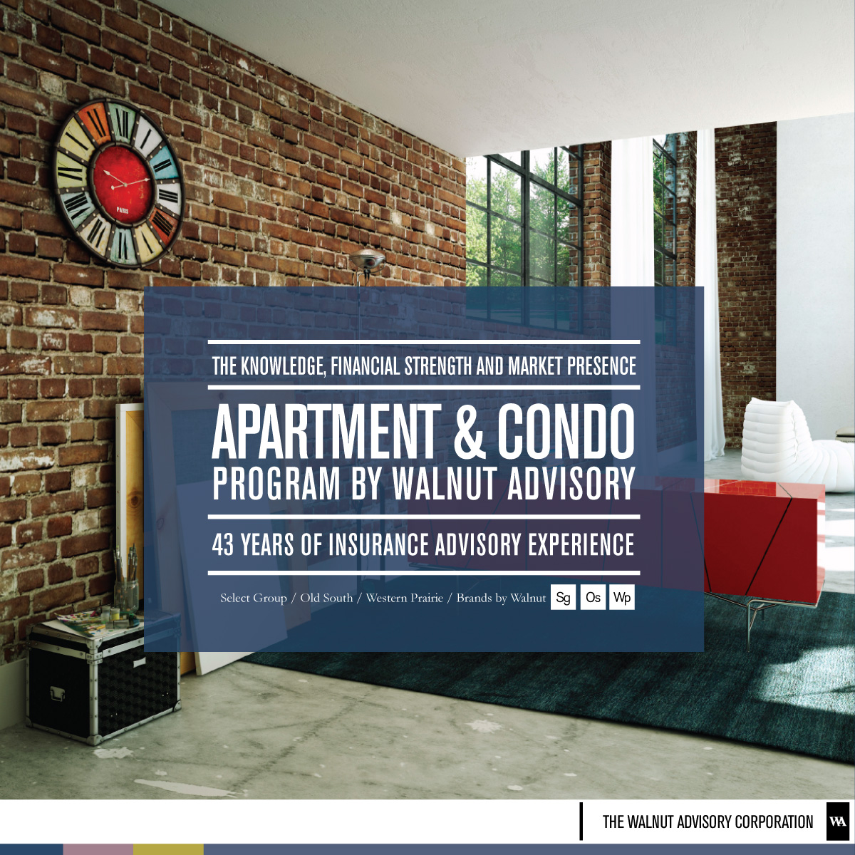
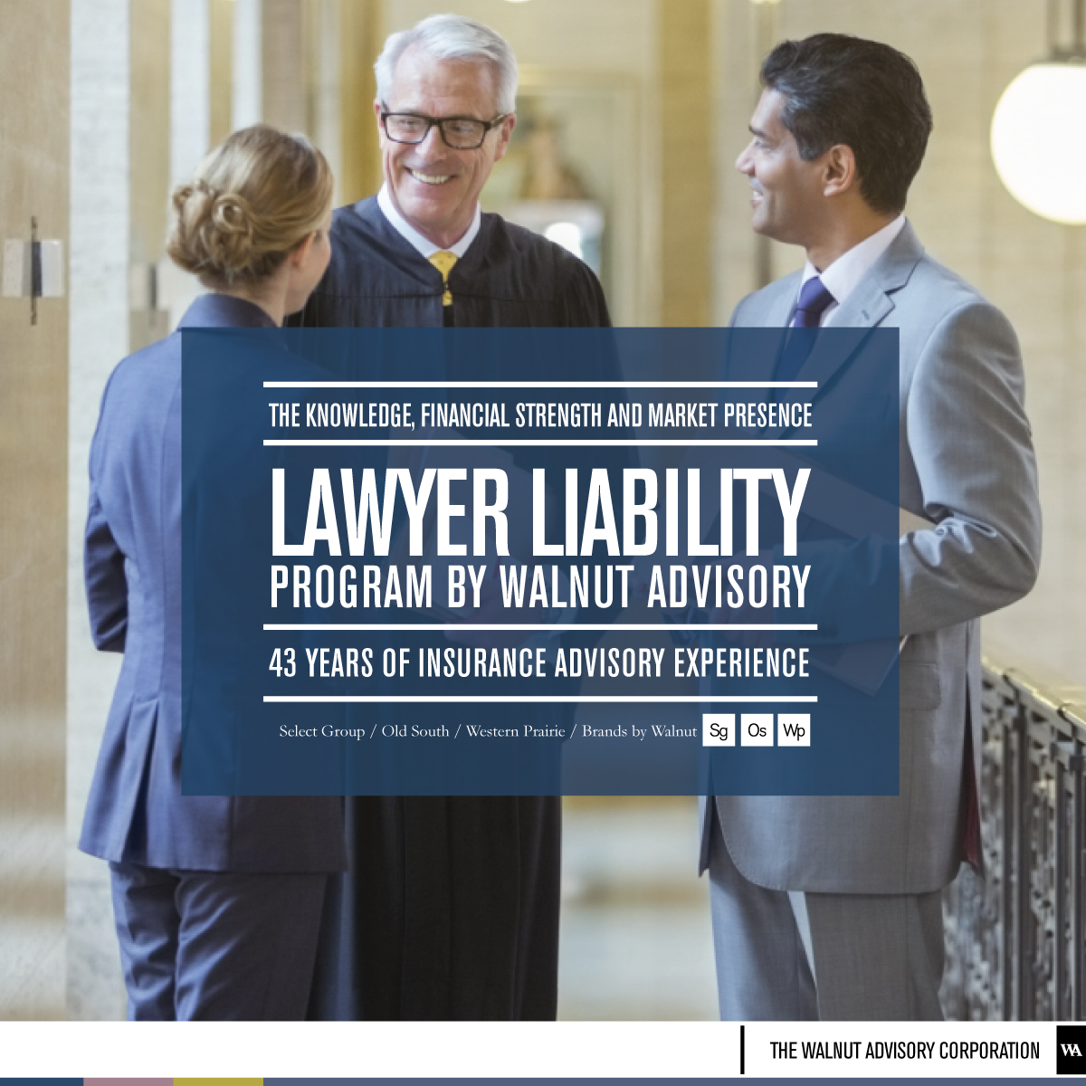
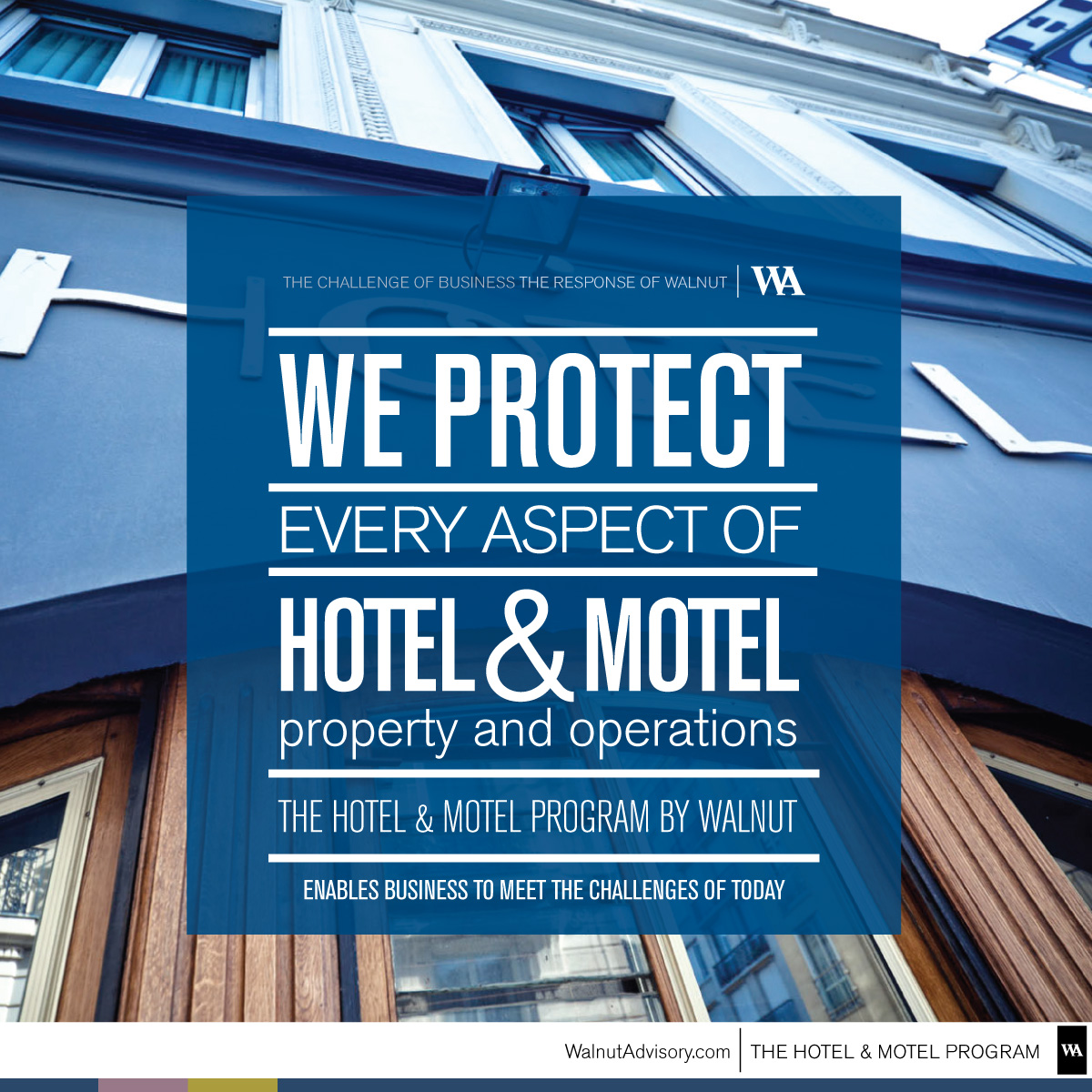
With a photograph chosen to represent the company, creative was developed for the company look and feel, using typography and the icons to convey the value and differentiators, and provide visual organization for the creative developed for the company offerings. The layouts for the company image incorporated the identity system, brand message, design elements, and the copywriting. Applying the established company image and branded look, creative was developed for each company program, the programs as a whole, each company brand, and the brands as whole, using the established elements to create structure and set each apart. The flexibility established in the architecture of the offerings and the brand enabled the creative and marketing for the company brands to be interchangeable with markets served, and represent the northeast, southern, and western markets.
To launch the new brand, marketing materials were developed, and included offline, online, and social media components. A brand style guide ensured all efforts were within brand, defining usage and application of all elements of the brand and the creative, ensuring all efforts stay true to the brand.
Scroll down to view the project and the creative. To learn about the development of the product architecture to help build the brand, click here. To read about the Walnut Advisory website development, click here. To go back to the original page with the listing of the case studies click here.
Identity & the Company Image
Incorporating the value-driven brand architecture and structure of offerings into the purpose and the approach, the development of the identity system and company image included the logo redesign, secondary versions of the logo, suite of icons, color palette, typography palette, graphic lockups and the design of layouts. Developed to represent the company programs and brands, the icons were used to visually convey the structure of offerings and represent the brand value, and work with the messaging in the creative to showcase the brand value.
Because the programs and brands of Walnut were conveyed as elements-of Walnut, or parts of the whole, the creative approach and design of the icons played an homage to the periodic table of elements. In addition to the elements-of aspect, typography was the design approach, and the icons visually complimented and added-to the logo. The icons were a signature visual element in the layouts, tying all creative together, and providing reason and purpose. The application of the color palette as a design element within the layouts served as a visual anchor in the creative, and in addition to the icons and design elements, the color anchored all creative together.
Based on the deep value structure, proposition, and differentiators, the brand messaging was incorporated into the copywriting, and developed for the overall, each program, the programs as a whole, each brand, and brands as a whole, with statements, phrases, headlines, calls-to-actions, and taglines all working together in a value-driven-formula that was created from the structure and architecture.
Elements of the messaging and writing were applied to typographical design elements that calls attention to essential elements of the brand, using a typographical design approach to call attention-to specific statements that needed to stand out. This approach also helped create organization and a visual structure, and resulted in essential components within the layouts and company image.
With a photograph chosen to represent the company, creative was developed for the company look and feel, using typography and the icons to convey the value and differentiators, and provide visual organization for the creative developed for the company offerings. The layouts for the company image incorporated the identity system, brand message, design elements, and the copywriting. Applying the established company image and branded look, creative was developed for each company program, the programs as a whole, each company brand, and the brands as whole, using the established elements to create structure and set each apart. The flexibility established in the architecture of the offerings and the brand enabled the creative and marketing for the company brands to be interchangeable with markets served, and represent the northeast, southern, and western markets.
To launch the new brand, marketing materials were developed, and included offline, online, and social media components. A brand style guide ensured all efforts were within brand, defining usage and application of all elements of the brand and the creative, ensuring all efforts stay true to the brand.
Scroll down to view the project and the creative. To learn about the development of the product architecture to help build the brand, click here. To read about the Walnut Advisory website development, click here. To go back to the original page with the listing of the case studies click here.

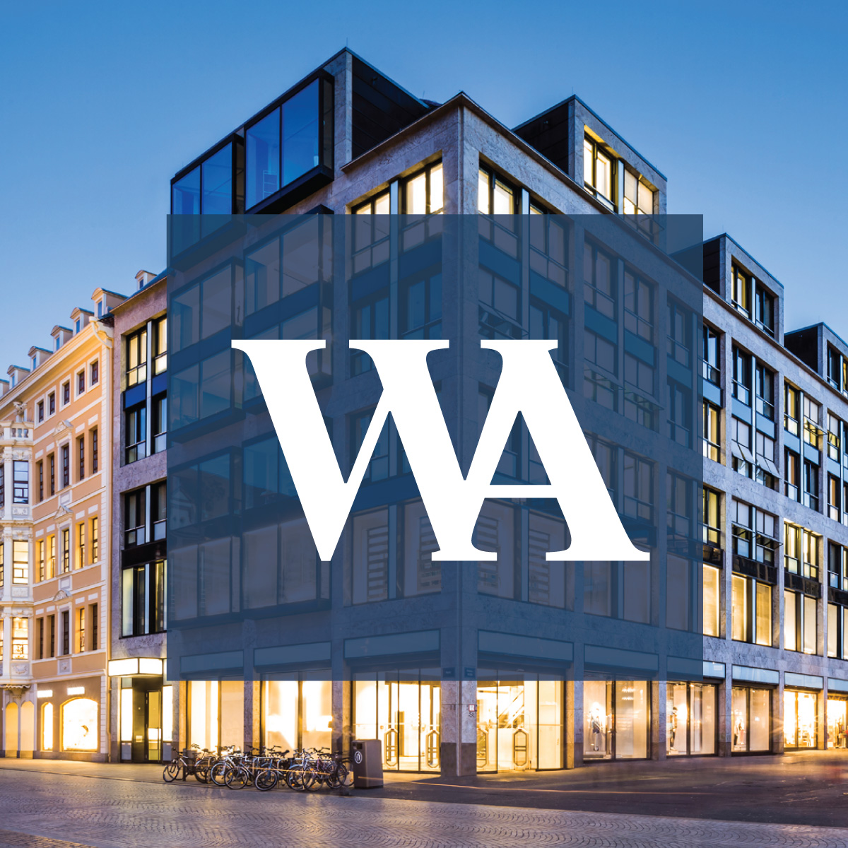
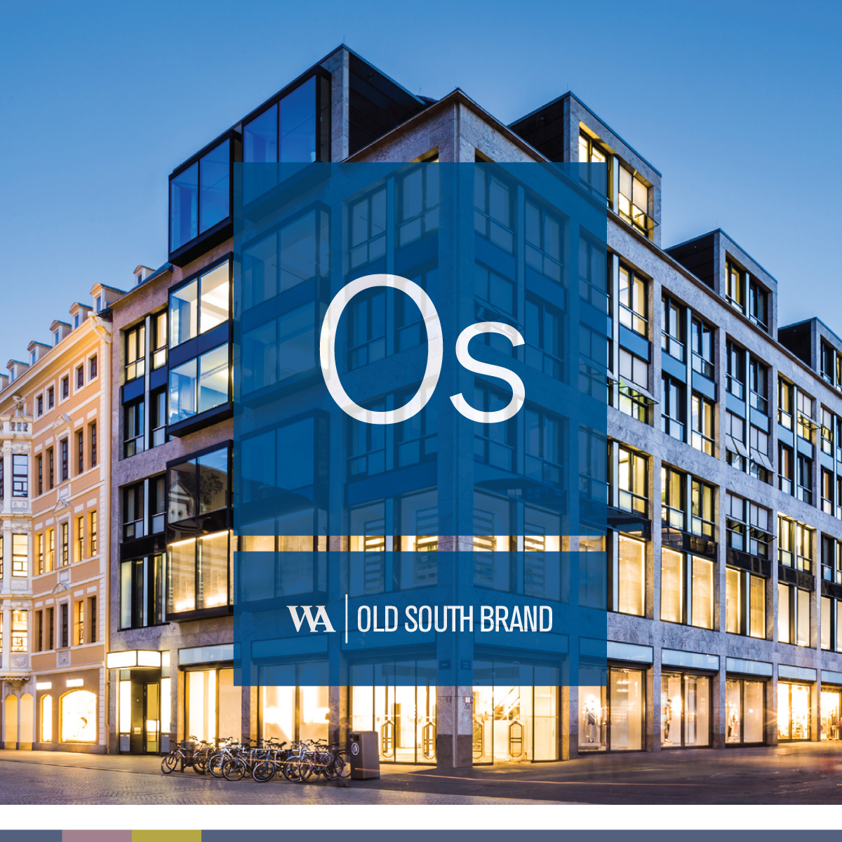
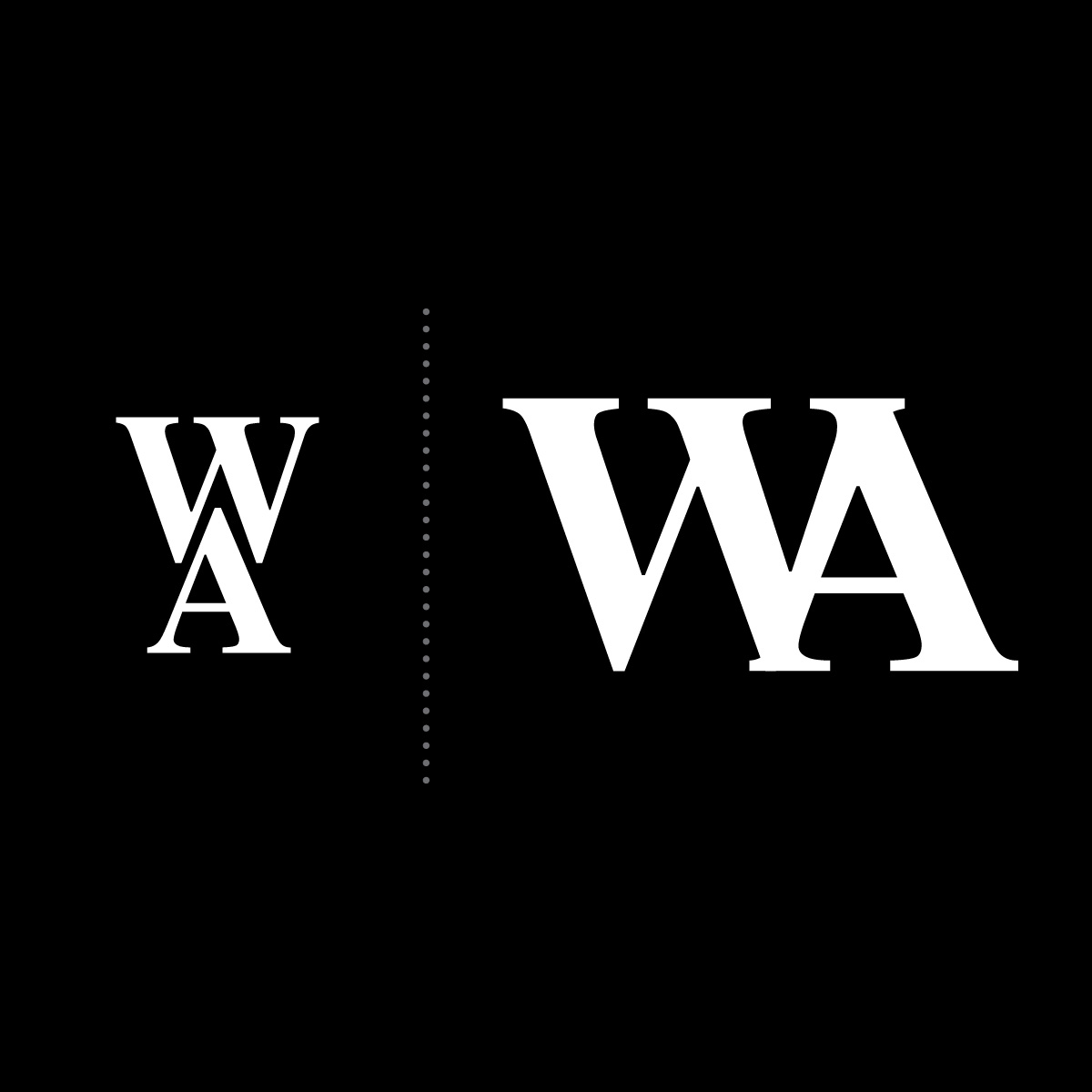
Building on 41 Years of Equity
The identity system design was centered around the redesign of the logo which incorporated the 41 years of equity, an element too valuable to neglect. The equity was even more important because it was the only consistent representation of the company, and losing that equity would have been a disconnect. The new logo incorporates the concept and feel of the original logo, with the typeface and holding shape, with the initials now on an even plane to convey the offerings and company are one on the same and the offerings are an element of the company, further conveyed through the design approach used to create the graphics of the identity system.
The identity system design was centered around the redesign of the logo which incorporated the 41 years of equity, an element too valuable to neglect. The equity was even more important because it was the only consistent representation of the company, and losing that equity would have been a disconnect. The new logo incorporates the concept and feel of the original logo, with the typeface and holding shape, with the initials now on an even plane to convey the offerings and company are one on the same and the offerings are an element of the company, further conveyed through the design approach used to create the graphics of the identity system.
Over a five year plus period, in addition to the layouts, the design elements and messaging within the creative were continually evolved, keeping the brand fresh while staying true to the brand as defined in the style guide. The use of typography was designed into visual elements to call attention to the brand message, and as the brand evolved, the typographical design elements were added to and built on, becoming more prominent as time passed, and marketing efforts continued. Colors were added to the existing palette, with colors working to visually anchor layouts and developed creative.
Summary Walnut Advisory
The architecture of the brand was created to communicate the deep value structure and the structuring of the offerings, enhanced by the elements of the identity system, graphics, and the design approach, with typography not only immediately calling attention to the brand's value, but helping to visually organize the creative.
Next Case Study: Website development
See how the value-driven brand, structure of products, image, message, and value proposition was applied to the development of the company website. Read the Case Study
Next Case Study / All / Previous
The architecture of the brand was created to communicate the deep value structure and the structuring of the offerings, enhanced by the elements of the identity system, graphics, and the design approach, with typography not only immediately calling attention to the brand's value, but helping to visually organize the creative.
Next Case Study: Website development
See how the value-driven brand, structure of products, image, message, and value proposition was applied to the development of the company website.
Read the Case StudyNext Case Study / All / Previous
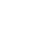


Case Study Signature Advisory
In the development of the Signature Advisory brand, the writing, the selection of imagery, the identity design, company image, and foundational elements of the brand were developed simultaneously. In this approach, the imagery, visual elements, and written word are one, with the style, feel, and tone consistent across the board. In the design of the identity system, the logo incorporates elements that visualize journey, navigation, and vision, core elements of the developed visual brand.View Case Study
In the development of the Signature Advisory brand, the writing, the selection of imagery, the identity design, company image, and foundational elements of the brand were developed simultaneously. In this approach, the imagery, visual elements, and written word are one, with the style, feel, and tone consistent across the board. In the design of the identity system, the logo incorporates elements that visualize journey, navigation, and vision, core elements of the developed visual brand.
View Case Study
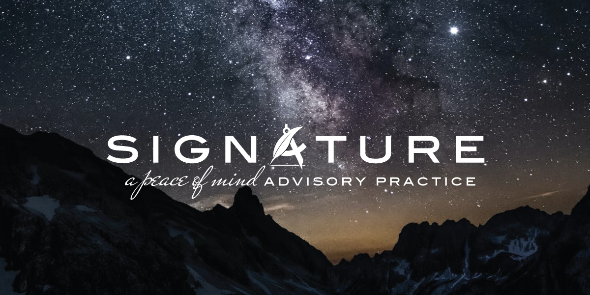
Case Study Unique Approach
Rather than showing photos of products alone, in the development of the Everline Doors brand development, the creative approach taken was to showcase the products in use, in buildings and facilities where the products con be used, to convey product features and product benefits, with corresponding writing, messaging, and visuals communicating product features and benefits.View Case Study
Rather than showing photos of products alone, in the development of the Everline Doors brand development, the creative approach taken was to showcase the products in use, in buildings and facilities where the products con be used, to convey product features and product benefits, with corresponding writing, messaging, and visuals communicating product features and benefits.
View Case Study
Case Study Logo Design Process
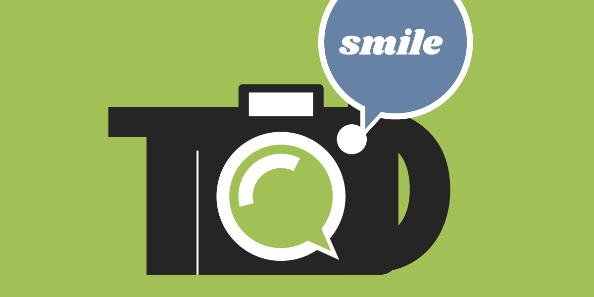
In the design of a logo, creating the tone, style, and feel of the logo are important, and in the development of the eventual business image. As part of the project process, the initial versions of the logo presented to a client should include multiple visual directions. With the designed logos having a style, feel and tone, with multiple different directions possible. Once a direction is chosen and the design finalized, it is carried into the design and development of the identity system, and then the brand image.View Case Study
In the design of a logo, creating the tone, style, and feel of the logo are important, and in the development of the eventual business image. As part of the project process, the initial versions of the logo presented to a client should include multiple visual directions. With the designed logos having a style, feel and tone, with multiple different directions possible. Once a direction is chosen and the design finalized, it is carried into the design and development of the identity system, and then the brand image.
View Case Study
Case Study Fundraising Campaign
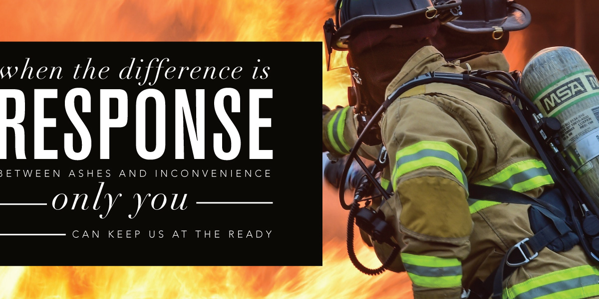
Commissioned to take a fresh approach on the annual fundraising drive campaign for the Upper Makefield Fire Company, this multi-platform campaign was developed to raise funds for the fire company; equipment, education, and resources. The developed approach conveyed the importance of the fire company to the community should an emergency happen. The project development included concept, approach, message, and design, applied to the design of a letter-sized ad, sent through the mail, and corresponding creative applied to the web and social media.View Case Study
Commissioned to take a fresh approach on the annual fundraising drive campaign for the Upper Makefield Fire Company, this multi-platform campaign was developed to raise funds for the fire company; equipment, education, and resources. The developed approach conveyed the importance of the fire company to the community should an emergency happen. The project development included concept, approach, message, and design, applied to the design of a letter-sized ad, sent through the mail, and corresponding creative applied to the web and social media.
View Case Study
Case Study Design Evolution
With the goal of building on the established event brand for this annual to semi-annual event to promote the Reach Organization, raising funds and awareness, each event poster and corresponding creative built on the previous event creative, delivering consistency and tying all three together. Each poster design and it's graphic elements incorporate visual elements of the previous creative, to continue to build presence for the event and organization.View Case Study
With the goal of building on the established event brand for this annual to semi-annual event to promote the Reach Organization, raising funds and awareness, each event poster and corresponding creative built on the previous event creative, delivering consistency and tying all three together. Each poster design and it's graphic elements incorporate visual elements of the previous creative, to continue to build presence for the event and organization.
View Case Study
Case Study Flexible Logo Design
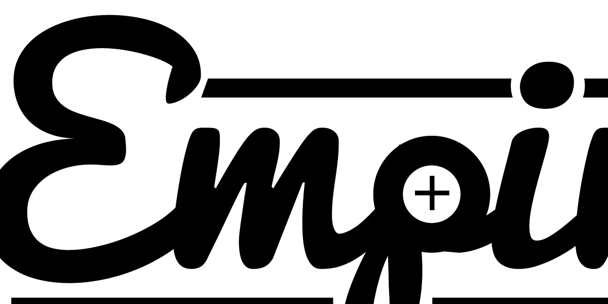
This suite of typographical logos incorporates relevant graphics that represent each service as individual companies and anchor elements universal to all three. The typographic name, ruler element, plus graphic, and typeface are consistent in all three–serving as the anchor elements, while graphics unique to each service and company set each apart. This approach provides a flexibility while ensuring all three are "within brand".View Case Study
This suite of typographical logos incorporates relevant graphics that represent each service as individual companies and anchor elements universal to all three. The typographic name, ruler element, plus graphic, and typeface are consistent in all three–serving as the anchor elements, while graphics unique to each service and company set each apart. This approach provides a flexibility while ensuring all three are "within brand".
View Case Study
Select Projects
The projects and work of Adam Garlinger, including logo design, business identity, and brand development for clients that include attorneys, insurance companies, networking, advisors, consultants, voice artists, and underwriters who are rebranding their corporation, building their business, and establishing a strong business presence. It's not only what we do, but how we do it.view projects
The projects and work of Adam Garlinger, including logo design, business identity, and brand development for clients that include attorneys, insurance companies, networking, advisors, consultants, voice artists, and underwriters who are rebranding their corporation, building their business, and establishing a strong business presence. It's not only what we do, but how we do it.
view projects
Recent Projects
The recent work and latest projects from Adam Garlinger, including building an online brand, carrying forward and applying and existing brand into a new brand, and building on the established value to generate revenue, in projects that include campaign development, building a brand and the development of a website under a brand umbrella.view recent projects
The recent work and latest projects from Adam Garlinger, including building an online brand, carrying forward and applying and existing brand into a new brand, and building on the established value to generate revenue, in projects that include campaign development, building a brand and the development of a website under a brand umbrella.
view recent projects
Featured Projects & Work
The featured projects and works of Adam Garlinger, with projects that include brand development, building a product offering, business ecosystem development, visual branding, campaign design, website development, creative process, and the brand evolution of a renamed business.view the featured projects
The featured projects and works of Adam Garlinger, with projects that include brand development, building a product offering, business ecosystem development, visual branding, campaign design, website development, creative process, and the brand evolution of a renamed business.
view the featured projects
Located in New Jersey where Washington crossed the Delaware into New Jersey to win the war, Design Solutions Adam Garlinger is an advertising and design studio that helps clients differentiate their business from those they compete with...to stand out, be seen, and be remembered.
Delivering the first impression their business needs to accelerate the return on investment that is their business.
38 River Drive, Titusville New Jersey | adam@adamgarlinger.com
38 River Drive, Titusville New Jersey | adam@adamgarlinger.com
Design Solutions Adam Garlinger | 908.581.3393
 |
 |
 |
 |
 |
 |