


Identity Design Case Study
In the development of the Signature Advisory brand, the writing, the selection of imagery, the identity design, company image, and foundational elements of the brand were developed simultaneously. In this approach, the imagery, visual elements, and written word are one, with the style, feel, and tone consistent across the board.
In the design of a logo, elements created in the design process often become the components of an identity system, as design is a holistic process. In the identity design for Signature Advisors, these elements were developed into the secondary logo, the logotype, namemark, wordmark, icons, and graphic elements. In the design of a visual brand there is a purpose, reason and rhyme for the components, as they are created to provide a visual solution, working with messaging and writing to create a visual language. The outcome is further strengthened when identity design, choosing imagery, layout design, and writing are done together, as one.
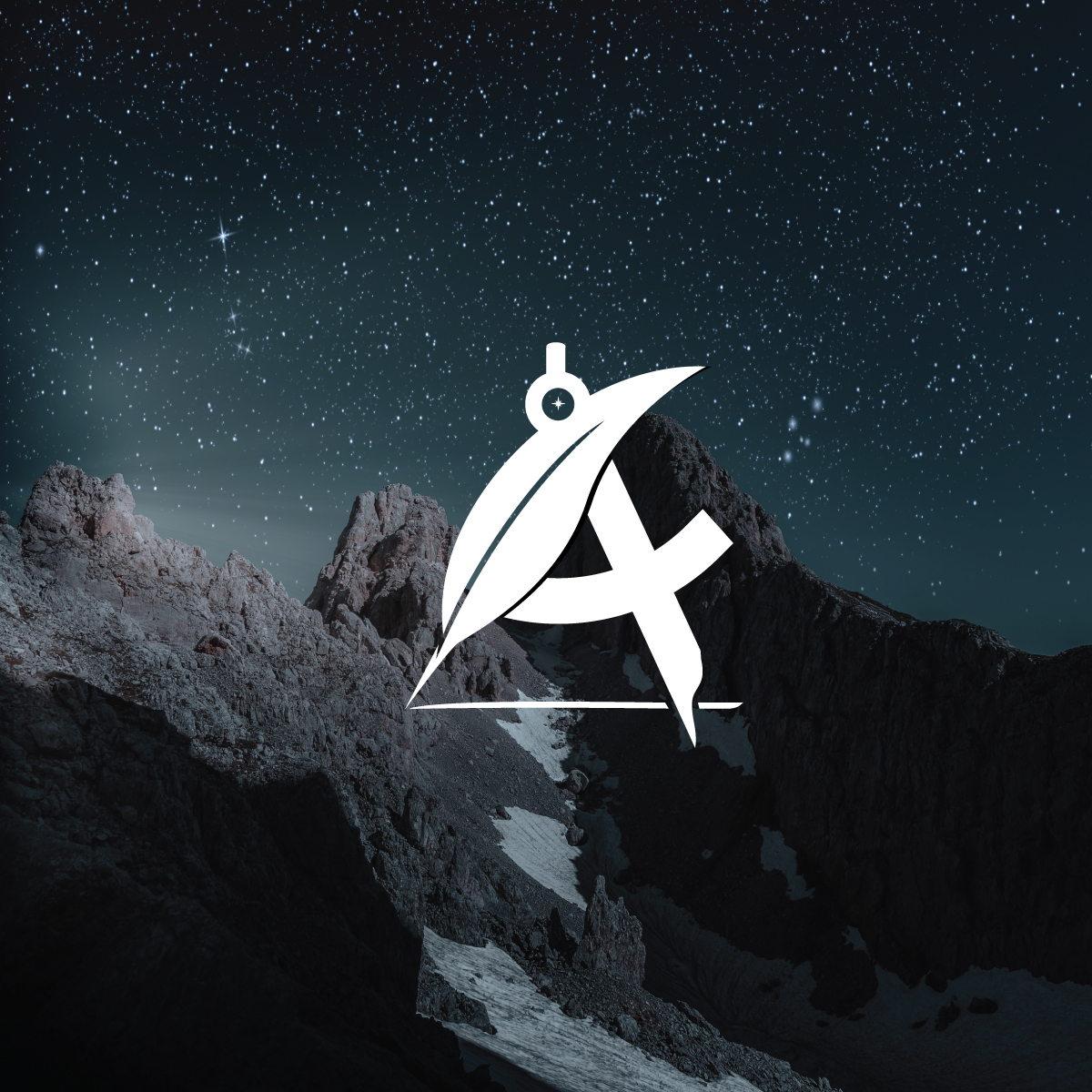
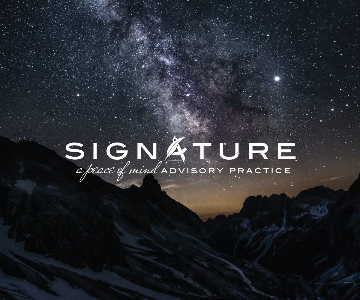
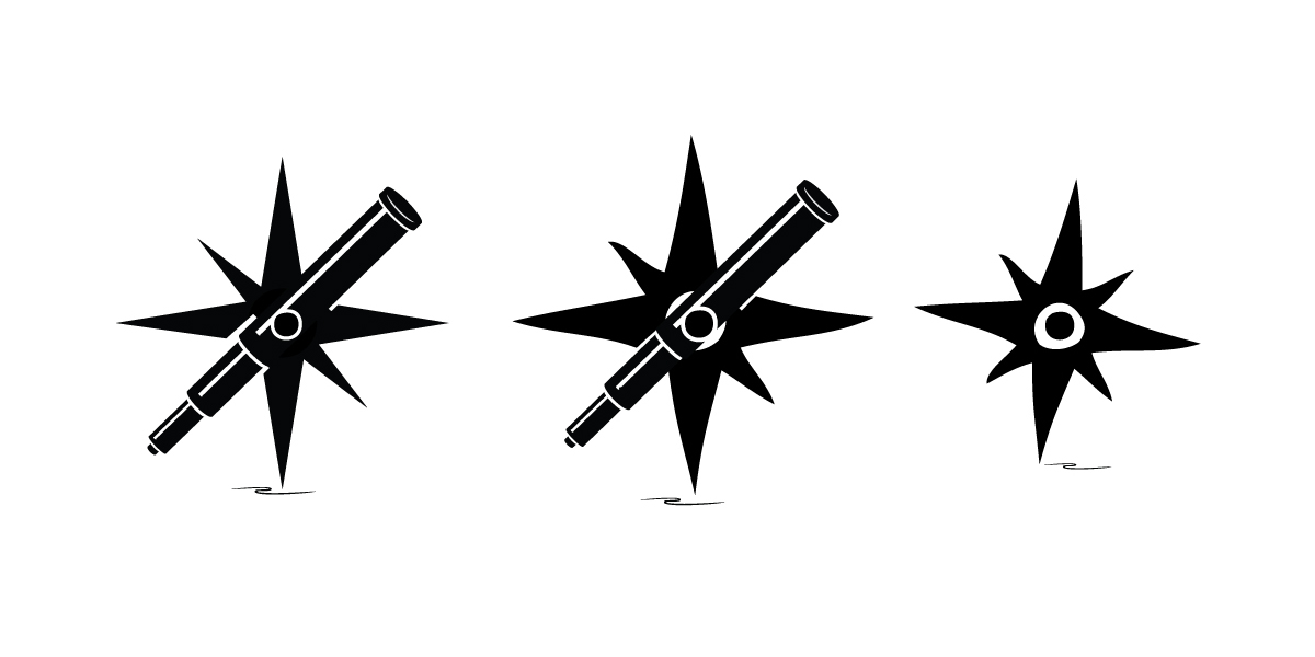
In the design of the identity system, the logo incorporates elements that visualize journey, navigation, and vision, core elements of the developed visual brand. These logo’s elements were then used to create the components of the identity system; the secondary logo, logotype, alternate logo, icons, graphic elements, and namemark.
The typeset name in the logo would be developed into the logotype, and the compass element developed into the brand icon, for use in small spaces, such as LinkedIn and other online platforms.
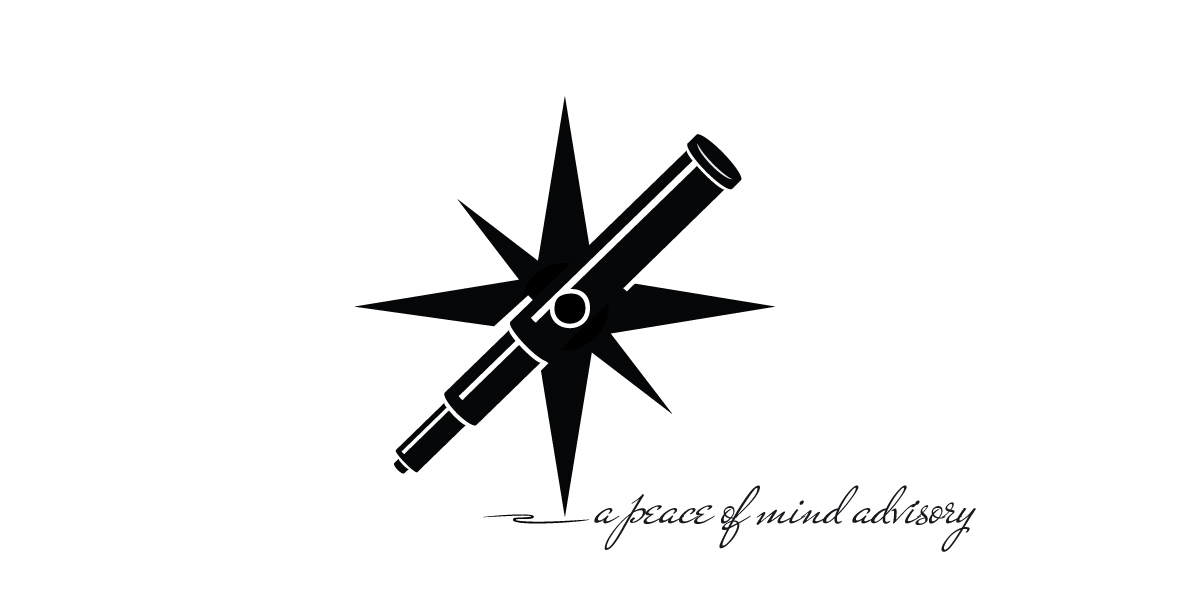
An alternate version of the primary logo was created to work in layouts for communication materials. In the design, the compass was intended to look hand drawn and rough, reflecting the outdoors imagery of the visual brand. Extending the purpose of the hand-drawn look, a suite of graphic elements incorporated messaging and elements in the logo, using the typefaces and hand-drawn look to achieve the intended visual result.
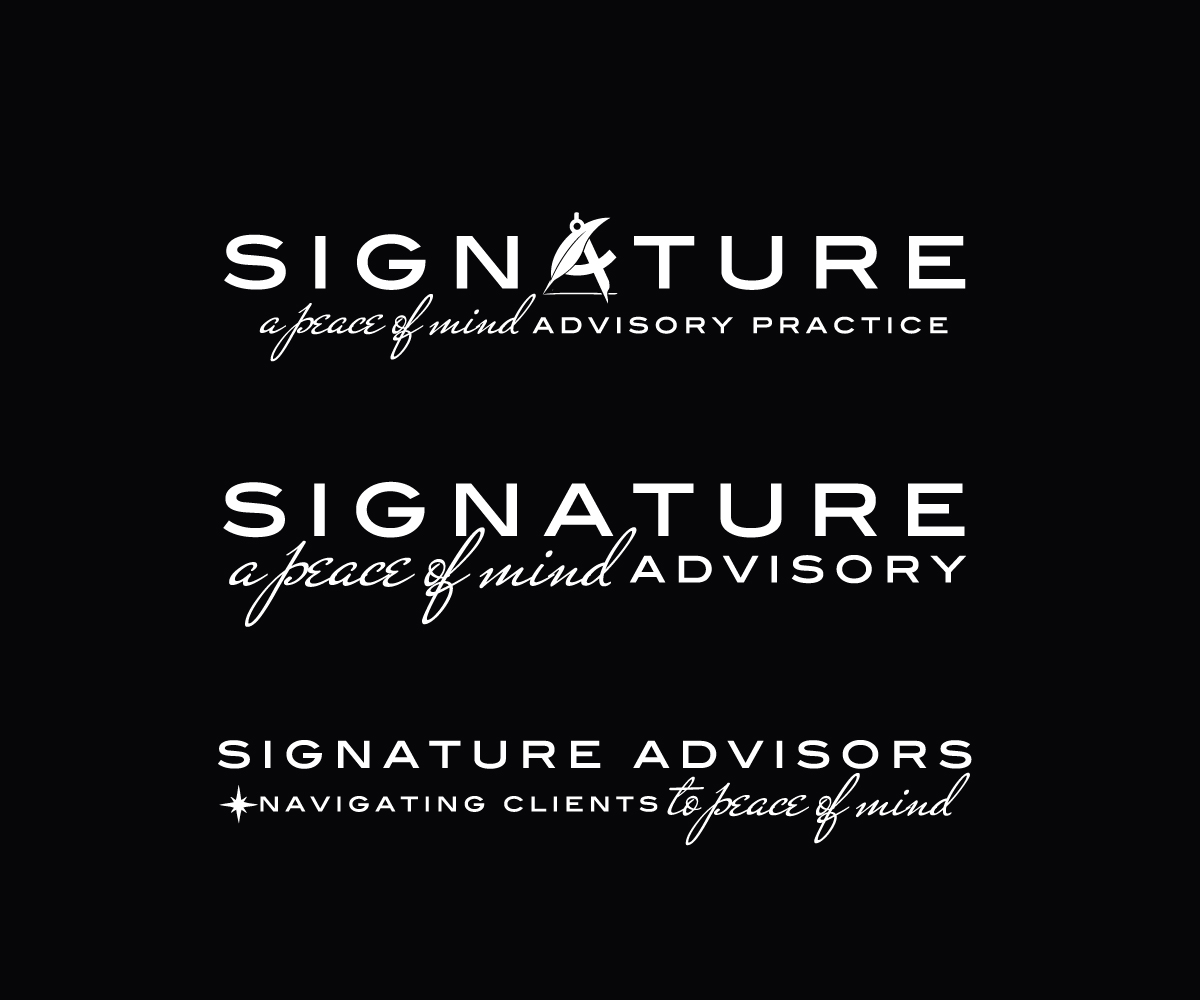
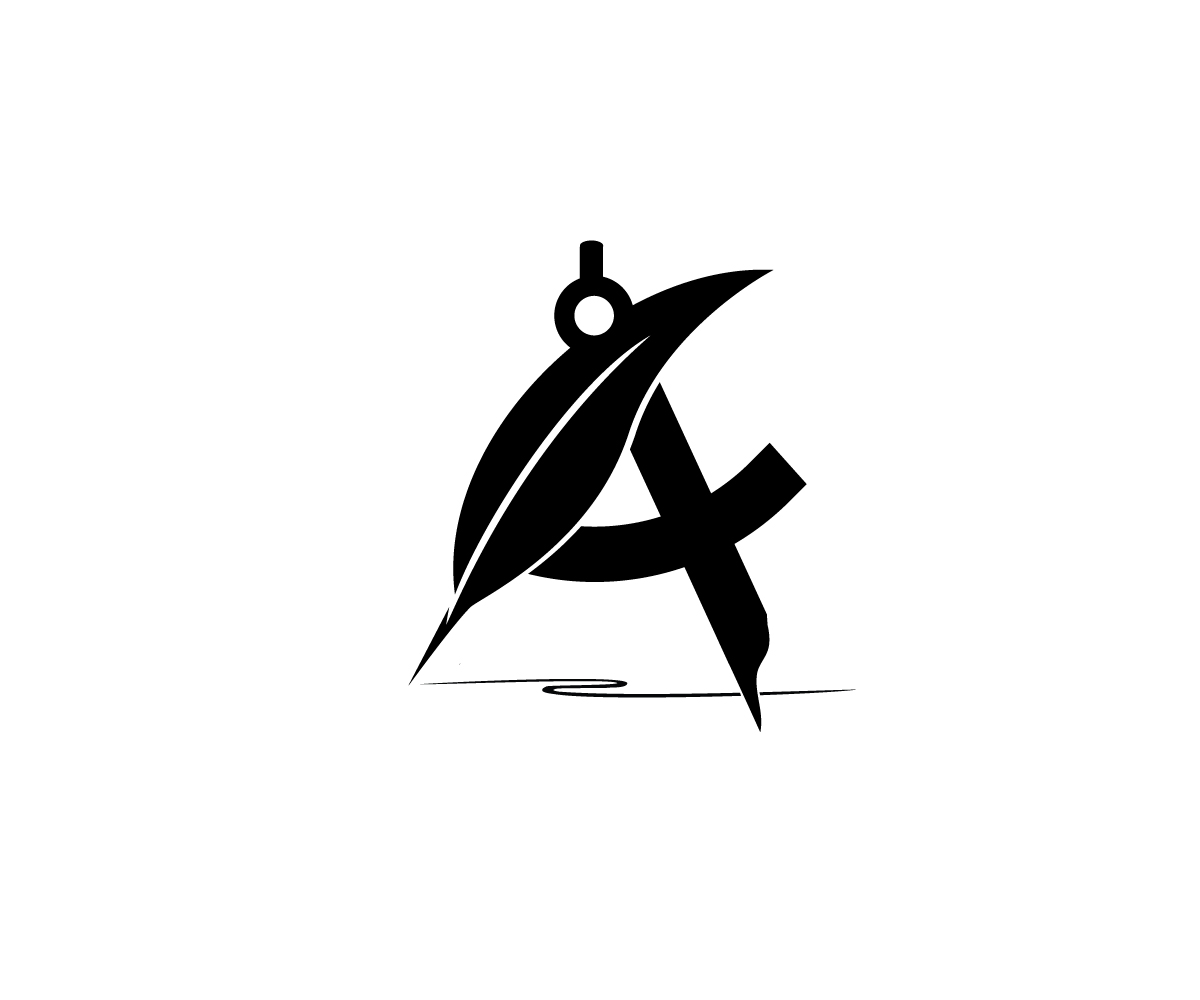
Designed from the name in the logo, the logotype incorporates a graphic made up of a quill pen and architect’s compass, functioning as the letter A in the name. The logotype provides further flexibility in the application of the graphics, with the usage defined in the style guide. Both the logotype and namemark are consistent, and used with messaging as graphic elements.
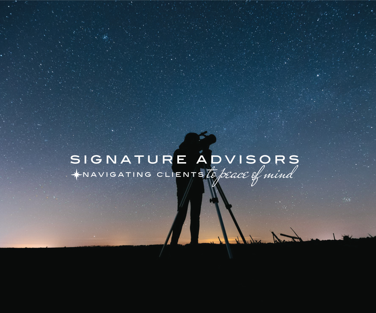
Incorporating the identity system and visual brand, the company image was designed and developed into layouts for communications, marketing, and the website. The brand style guide and design guidelines ensure the company image is consistent in all communication materials and on all platforms where the business is present.
To view the brand development in detail, click here. or, click here to view the Signature Advisory website.
Signature Advisors
In the development of the Signature Advisory brand, the writing, the selection of imagery, the identity design, company image, and foundational elements of the brand were developed simultaneously. In this approach, the imagery, visual elements, and written word are one, with the style, feel, and tone consistent across the board.
In the design of a logo, elements created in the design process often become the components of an identity system, as design is a holistic process. In the identity design for Signature Advisors, these elements were developed into the secondary logo, the logotype, namemark, wordmark, icons, and graphic elements. In the design of a visual brand there is a purpose, reason and rhyme for the components, as they are created to provide a visual solution, working with messaging and writing to create a visual language. The outcome is further strengthened when identity design, choosing imagery, layout design, and writing are done together, as one.
In the design of the identity system, the logo incorporates elements that visualize journey, navigation, and vision, core elements of the developed visual brand. These logo’s elements were then used to create the components of the identity system; the secondary logo, logotype, alternate logo, icons, graphic elements, and namemark.
“The typefaces played an essential role in the visual brand, while also conveying the tone set in the messaging, writing, and photography.”
The typeset name in the logo would be developed into the logotype, and the compass element developed into the brand icon, for use in small spaces, such as LinkedIn and other online platforms.
An alternate version of the primary logo was created to work in layouts for communication materials. In the design, the compass was intended to look hand drawn and rough, reflecting the outdoors imagery of the visual brand. Extending the purpose of the hand-drawn look, a suite of graphic elements incorporated messaging and elements in the logo, using the typefaces and hand-drawn look to achieve the intended visual result.
Designed from the name in the logo, the logotype incorporates a graphic made up of a quill pen and architect’s compass, functioning as the letter A in the name. The logotype provides further flexibility in the application of the graphics, with the usage defined in the style guide. Both the logotype and namemark are consistent, and used with messaging as graphic elements.
Incorporating the identity system and visual brand, the company image was designed and developed into layouts for communications, marketing, and the website. The brand style guide and design guidelines ensure the company image is consistent in all communication materials and on all platforms where the business is present.
To view the brand development in detail, click here. or, click here to view the Signature Advisory website.


 |
Case Study Notes
To build a stronger business brand, the value, differentiators, and competitive advantage are applied into a deep value formula to build a deeper business brand. Then developed into the writing, messaging, and written content to create a compelling value proposition, and better position and present the business.
In the design of a visual brand and the business image, the process includes choosing the imagery that represents the concept, tone, and feel of the written word, the design of logo, the brand identity system, including the graphic elements, the typography, colors, and the exploration of layout design, This is a seamless process, to ensure the visuals and written word work as one.


 View Case Study